In the last few days, we have looked at patching gestures you need to perform all the time.
You expressed the wish to look at those gestures for quite some time. And now, with the new release on the horizon, it felt like a good idea to have another look.
In the last year, we worked on lots of improvements in the node browser and the patch editor. But in the end, it’s not at all about what happened, but how the status quo feels like. So it was quite clear that still there was and is stuff to do. And while some of the improvements are barely noticeable with the naked eye - less unused pins, tooltips (…) - but take ages to implement, others are in the face and surprisingly fast to implement. This was the case for those central gestures…
It’s my pleasure to announce progress in regards to patching speed and interaction reliability.
Mainly it’s about link drawing and pin interaction:
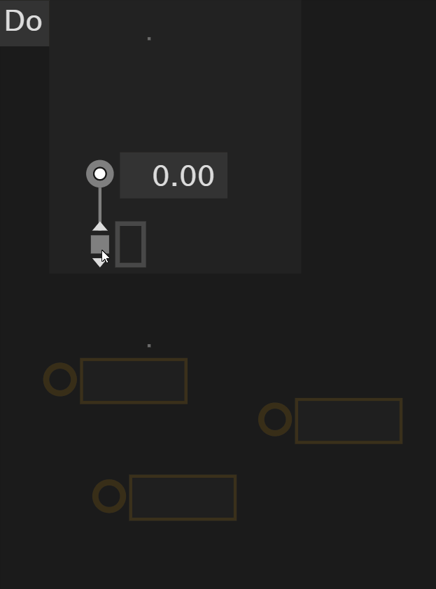
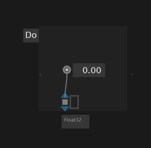
pins are easier to interact with as their interaction area increased
pin tooltips moved a bit so that the mouse doesn’t occlude them
sloppy clicks are allowed
you can even drag out the link out of the pin, pad, or control point. the click interaction is still possible and probably more comfortable for longer links
feel free to mouse up at any time. the link will survive
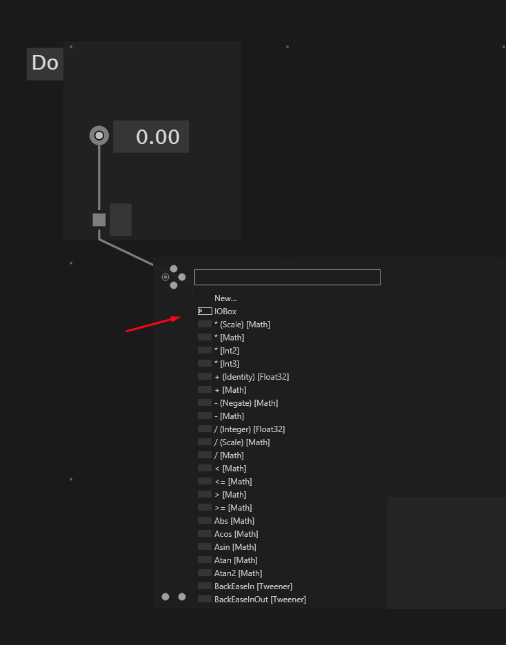
the node browser opens up with an “unprecise” double-click (while linking or not)
for those that don’t like middle-clicks: to create an iobox at the end of a link: double-click, choose iobox, get the iobox correctly typed
canceling link drawing via right-click is easier to achieve. panning only occurs when the mouse moved a bit
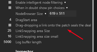
setting: “Drag-dropping a link onto the patch seals the deal”: dropping a dragged-out link onto the patch either creates something directly (modifier keys) or opens the node browser
if you drag a link out of a pad, IOBox, or control point the drag direction determines the link direction, which feels logical. It feels like drawing the beginning of the link. This solves the aftermath of the up-down linking feature. (clicking or dragging to the side still leaves the direction flexible.)
Let’s please centralize the feedback and potential bug reports regarding those changes in this thread.
Please test 6.0 previews >= 101 and for any feedback tell us which exact version you are referring to.
Thrilled, and happy to hear your opinions.
Ok cool, have a nice patch!
Need to use it more, but the “Drag-dropping a link onto the patch seals the deal” option (extra points for the settings name ;-) ) is very efficient and super interesting. This feels really fluent.
During Genuary I cursed a LOT and wondered if I will ever get used to the clumsy interaction in VVVV, but that feels like history now, even with these first adjustments.
And a Wacom tablet is now a first class citizen with it’s “sloppy” clicks and moves.
I still want a shortcut for the nodebrowser and still think it should be TAB, but I will survive until then with these initial adjustments.
A click-reduction by something like 75% isn’t too shabby for starters!!! :-)
Didn’t know about the multi-connection with middle click - cool, thanks yar!
Is it new/intentional that rectangle-selecting a node from the top down doesn’t show it in the inspector but from the bottom up it does. Although it seems to be semi random sometimes (using 0103)?
In my opinion the setting about sealing the deal could be enabled by default and removed, it is just so handy to constantly seal the deal. But don’t know how others see this… If it is turned off I would suggest to make the link abort / cancel when dropped on the canvas, I think this is how Max and PD are treating this (also TD I think?). Currently it keeps stuck at the mouse when dropped, which I would expect only to happen when someone directly clicks on a link.
I think the old design for the pin indicators was perfect, those tiny gray triangles that have the same size as the pins themselves. IMO there is no need to make them as big as they are now, or even in another color.
@chk All right. Let’s use a term like this - “Seal the deal”! Make sense. But I guarantee, given the multilingual nature of the users, it will cause a lot of confusion. It will probably have to be called something else one day.
I probably agree with @chk - we should move towards implementing this kind of comfort patching by default to create a seamless UX experience
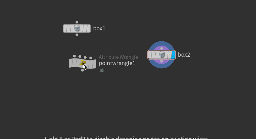
It seems that the most needed thing with SealTheDeal® is IOBoxes.
upd: I noticed that they were in place
super nice!
But can we think about “forcing” another type of IOBox?
Imagine this use case: I’m creating a float IOBox, then decide to create a string IOBox and in the middle wire insert a conversion. Maybe when I click on “IOBox” I should be given a choice of “Pass value” or “Create another IOBox type”? For example, it is often a problem that casting can get in the way of creating the right type, interface implementations and other things.
I think this is a whole different topic/feature about automatic type conversion, which would require to insert nodes automatically while patching. I agree, it would be extremely nice, and it was discussed and requested several times already - but I think it is maybe a bit too early to open that topic right now… let’s focus on suggestions to make the current state better.
Also, please allow me to bring another topic to this. If it’s too confusing I could also create a new one and crossreference it there.
What about snapping nodes to a grid? That would allow to make cleaner patches more easily. I really like all the stuff you can do in Châtaigne : having a grid with a custom resolution, snapping to it or not, center/align/distribute nodes with a UI :
Again, can open a separate thread if need to discuss that.
I actually like the larger triangles to make it absolutely clear that I am over them, the old ones were rather subtle when zoomed out, but I think something in between the current and the old size would be sufficient. ATM the triangle looks a bit “bland”, maybe that also contributes to making it a bit out of place. The old one was more “embedded” looking. A small outline maybe?
(still on 103 here, have to update again…)
+1 for making the “seal the deal” - under whatever name - setting the default. I think especially for newcomers this would give an instant feel of being closer to the tarmac without needing as many shortcuts and mouse combinations as before.
Old hands can easily disable it, but newcomers should be made as welcome as possible IMO.
And yeah, CTRL, SHIFT + ALT are now very handy with the wire/link dragging for instant IOboxes, In/Outputs and Pads.
+1 for node snapping.
In Houdini it’s very well done and it makes everything more clean by default without one even having to think about it or needing additional shortcuts.
It’s not a fixed grid (which often doesn’t work too well in my experience or can feel kind of rigid) but more an “align to what’s close” implementation - nodes outside the view are not snapped to:
That subtle green line to show you what you align to is never in the way and the snap isn’t too hard, so it’s easy to still do your own layout if you want - and of course you can deactivate it.
It is simply a “snap to the center”, which covers most cases without becoming too complicated.
Totally agree with this. Maybe call it “Open node browser when drag-dropping link on canvas”, or so? And otherwise, when the setting is off, cancel the link?
It made me remember! And does anyone remember those nice, automatically squared-off wires? Maybe we can bring back other types of connections a la Beta? Is it worth it? A significant amount of time is spent arranging the wires in the patch.
Also to put it up for discussion (also mostly Beta inspired):
“Hiding” parts. Not really hiding, I always used this thing to mark the most important things and the less important things. Maybe some kind of marking mechanism, but two states was enough. However, it would be interesting if it were possible to mark coloured groups (ctrl+1, ctrl+2, etc.). This mode can be switchable.
More granularly editable IOBox. IOBoxes in Beta was part of the UI and UX and was a one of the most important tool. Not sure if it’s worth discussing in this thread, but anyway it’s a very important part - editing and interacting with such elements. Now we really lack good mechanics, and have poor UI / UX on that, beta was significantly better in that aspect. It would be really cool to be able to write your own widgets. Beautiful editable matrices, plots and quickly accessible faders are just the tip of the iceberg.
The next two aren’t as realistic, but I’d add them so you can think about which way I’m thinking:
Multiple connections on a single pin. Yes, it’s somehow extremely against the current UX concept. But wires can hold the properties and it opens a door to new UI/UX concepts - dictionary constructions with only one sink, sums without cons / conc (I always mix them up, not sure which one), collectors of observable, events and etc. Why not try it? There are a lot of nodes that will be easier to use with such a concept.
This was rarely used, but in beta there was an option to create a widget from a node - Ctrl+2. Pretty poorly implemented mechanic at the time, but I still wonder why we can’t do it now? Then we could do patches a la modular synths, especially in the case of being able to patch facade, not just pins at top/bottom. Probably best place to make grid and widget based interface