@gregsn How many versions of the behaviour between 104 and 112? Is it worth trying different ones?
Surprising, but so far I like the direction we’re going! Good hinting!
But I really want this behaviour to become the default not only for drag and drop, but also for click-based behaviour. It’s like I expect it when I do it “the old way” and I get very frustrated when that expectation is violated.
Is it also possible to set the type of histeresis to this distance? The “direction cancellation” distance should be proportionally smaller than the “direction selection” distance (or is this already the case?).
Although I feel comfortable with it (largely due to the fact that click-based behaviour is implemented by default), I tend to agree with @chk.
I think my suggestions are not fully understood. I’m suggesting hints, not bringing back previous behaviour.
Let me give you some examples.
Try using your phone upside down. When you press the buttons, you’ll notice that you can’t press them the way you used to. That’s hinting. Your taps on the screen are processed and go through a series of transformations to tell the phone where you really want to tap, not where you are tapping. There’s a lot of this hinting in interfaces, sometimes you don’t even know it’s there. For example, in the old Opera browser (based on Gecko) there was one thing I still miss. If you selected text from left to right, the text was highlighted even in links, and if you dragged up or down, the link was “pulled” to move to another field. Can you imagine my disappointment when the old browser died? I was constantly dragging and dropping links instead of copying them. More importantly, it took me a long time to figure out why this was happening.
The 112 version seems to have the most correct direction of thought. But we need to fine tune this behaviour a bit.
I like that the app tries to notice where I have clicked - at the top or at the bottom. I like that the distance of the click ‘anchors’ my decision. In fact, I’m starting to like Chk’s idea of free choice of direction when the app tries to track what I’m doing. But what about the idea that the final decision should be based on a combination of factors? If we create a semantic category of “certainty of direction”, there would be plenty of opportunity to fine-tune this behaviour. I’m sure it could be useful in a lot of places…
In fact, I suggested earlier something conceptually very similar: distance anchors the decision, direction matters.
But let’s say we don’t have “left” and “right” with pins. But why can’t we consider that I move much more east-south-east than east-north-east? Angle of movement and amount of movement can be part of the engine for making such decisions.
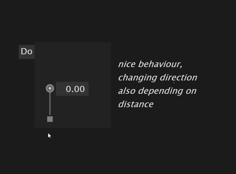
To illustrate what I mean as much as possible, I ask you to look at this patch. I’ve made an example specifically to make sure that what I’m suggesting is both possible and feels right. After making this patch, I have no doubt that this is how it should be done. Yes, it looks a bit complicated, but trust me, hinting in your phones is an order of magnitude more complicated.
If you implement this algorithm, please consider some important aspects:
I’m not sure, but maybe recording mouse values with frame discretisation is not a good idea. It might be better to use an asynchronous loop.
Some values need to be fine-tuned. There are a lot of values, but it doesn’t make sense to output them to the application interface. Let’s put these values in a config file so that everyone can tune them and share their config.
Some values should probably not be linear and it would be good to provide a coefficient for this non-linearity. You can see that I used Tween with a quadratic curve for the visualisation - I suspect that the angle deviation (dot product) values can be modulated by this non-linearity to emphasise the angle. Perhaps the tendency coefficient could also be non-linear - a smaller value closer to the centre and a larger value further away (or vice versa, hypothesis needed).
There are a lot of smaller corner cases. Prepare this algorithm to interact with other aspects of patching, such as shortkeys and behaviour modification by contexts. I would immediately consider the case that one day we will have multi-input pins. The most bothersome cases are proximity of other objects, drag and drop, and navigation.
There is a chance that a circular detection area may not be the best idea. What if we make the click detection area rectangular or oval? But re-entry region is left circular? This was an example. Real pins have a more upright shape for entry and grip.
I agree, this feels really good, and also illustrates very well what I mean with switching between top and bottom when hovering the pad again. I am also convinced it would work very well with both modes of “dragging a link” and “attaching a link to the mouse”.
It seems that in this case what I’m trying to do is impossible, but I realized it after five attempts to do it. Probably should be considered as a visual bug.
I can see that you are moving your mouse in a fast pace over the datahub you are trying to connect to, and it looks like you are frustrated, but I can’t see why you are doing this.
Please before looking into it can you record a gif that calmly shows the issue. Consider enabling this extension:
so that I can see what it is you are doing.
The above gif doesn’t tell me much…
You say: it doesn’t work four times and the fifth time it does. What did you change?
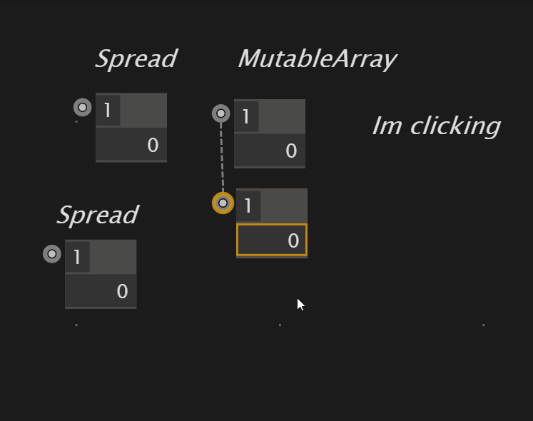
linking from MutableArray to Sequence is working.
linking from Sequence to MutableArray is not working.
as a mutablearray is also a sequence, but not vice versa.
the confusion comes from the green highlight, that lights up in both cases. when starting the link at the sequence, one thinks it can be connected to the mutablearray, which even is true, but this can swap the link.
when hovering the pad a second time vertically and therefore forcing the link direction, the green highlight is no more.
maybe the green ‘connectable’ indicator on ioboxes should indicate the direction, e.g. light up above or below the pad?
that works and results in a red link, because of the inheritance described above
Yeah, that’s right. That’s all I’m saying.
Actually, I personally understand what this is about.
But imagine yourself in the place of a beginner or a person less experienced in programming.
I’d also like to point out that when I’m in the “fluent-fluid-power-patching” state, such UX glitches feel like hitting a wall at full speed. You can’t even tell what’s going on, something just doesn’t connect, even though the hint is leading you.
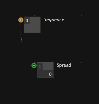
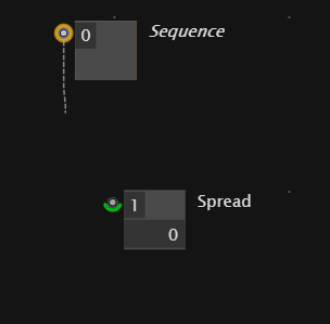
in this situation, you think you can connect the sequence to the spread.
when hovering, you see, that the link direction would be reversed (because it’s the only valid option)
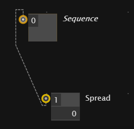
i’d go for the green highlight should also indicate the link direction. like so.
or so, if both directions are possible
i see that this approach is different from the current approach and bit’s questionable if both could work well together:
the main difference is, that atm. (0196) the link direction is determined on how you start the link (move mouse up or down after click) and the shown approach is determining the link direction by the target.
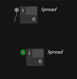
A) Both up & down still possible (showing sources and sinks in green)
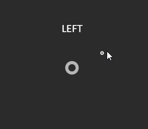
u) currently indicating up
d) currently indicating down
U) Upwards (only sources in green)
D) Down (only sinks in green)
only in A) we’d need these (beautiful) two green connectors. With U) and D) it’s already clear (however those two guys still would make it even clearer what will happen).
It’s a nice solution, but let’s see if there are others.
Currently, there is some logic when to switch between A)u) and A)d). One rule leads to the behavior we see above. And then there is some logic that switches to U) or D): when you come back to the start and move out again…
If we get rid of the A) feature altogether maybe everything gets clearer.
We kind of loose a feature, but it’s a lot easier to explain what happens:
When starting the link - no matter if via drag or click - the direction U) or D) gets decided somehow. @yar has a clever solution for that. Another solution is to just have a defined area, which when you leave the Y position of the mouse is the deciding factor, which could have the benefit of an easier-to-explain gesture
When not happy you come back or press a modifier key to switch
The main point here is that maybe the whole A) thing is just a bit too magic. And we should strive for simplicity.
What do you think? Worth a try?
We should clarify which version we are testing all this from. It will take some time to get used to it. In general, I’ve already noticed a lot more natural behaviour and everything feels quite good. But we’ll have to get into it and collect cases.
Do I need to turn anything on/off to use these settings?
@yar I improved the auto-segmentation of the links, but the behavior stayed the same for the last three weeks. So maybe this already makes it feel less irritating. Or it’s a matter of getting used to some behavior.
But to be clear: what I am suggesting above is not implemented yet. I’ll let you know which version to try.