Please make an outline that circles the button when it is pressed. Or explicitly set the “active-inactive” states in some other way.
In any case, you don’t need to do it the way it is now. It’s too counterintuitive now. I can’t remember where I last saw a button with this behavior, they have already disappeared as a species.
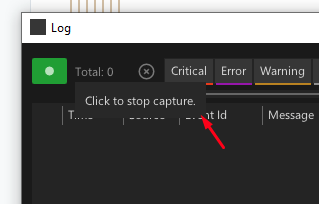
Is it active? would it be inactive if I pressed it? is it inactive if I pressed it?
glad it bothers you too! We are aware that the button is still ambiguous, but let’s leave comments like “they disappeared as a species and so on” aside. Look, there are always different aspects that one wants to emphasize and make user aware of.
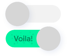
You are showing a Play button and it is green or off, so you want to convey an information that something is On.
But for the LogUI it is the other way around, it’s important to notify (or even alert) the user that the capture is Stopped (Off). Showing Red (for off) or gray (for on) button is strange, right? That’s why it is green/red now, which leads to the ambiguity. Probably there is a need for another Off indicator, not the button itself, like a small banner. But it shouldn’t take too much space and be the prominent at the same time.
@sebl:
Sure, I thought about them too.
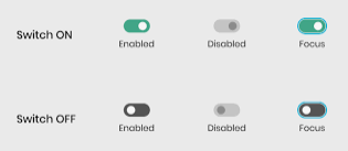
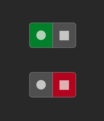
They are not soo different from the buttons, just a bit funnier, the dot is on the right or on the left.
In the LogUI you want to notify the user “hey, you are not capturing at the moment!”. And if this is an extra notification, then again, no need for a switch.
Or the switch can be red/green (like @yar just posted while i’m writing), but I fear, that leads to the same ambiguity.
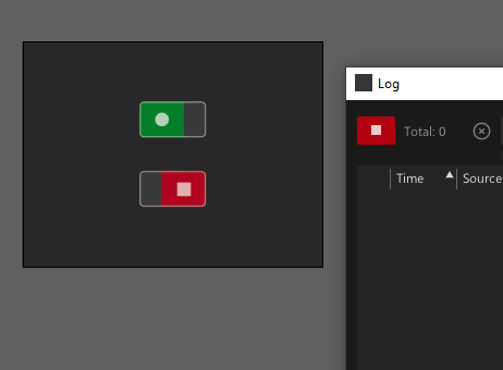
Yes, that is much closer and I was considering that too, but took too much space.
This way you introduce two buttons instead of one, they just look a bit funkier with a shape moving back and forth.
And with the Voila, you don’t want to have it Red saying STOPPED.
Sorry for that. Very painfully perceived UI / UX problems in VVVV. Vietnamese flashbacks after Beta.
I think it’s easy for the user to understand “something is working”, “logging is happening”. If you think it is important to introduce “Danger! Logging is not happening!”, let’s maybe implement a clear Switch that will give the possibility to switch this state.
@yar
That’s the whole point.
When you open the Log your expectations are that the logger is working and capturing messages. No need for notifications or understanding at all. What you want to do is to warn the user, that the logger is NOT capturing.
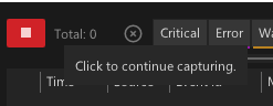
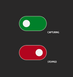
Your screenshots with the red/green toggle - the difference from the button is just that the dot is moving, right? So you have to click the Red toggle to Run and Green toggle to Stop. The current button is doing exactly that and looks ambiguous.
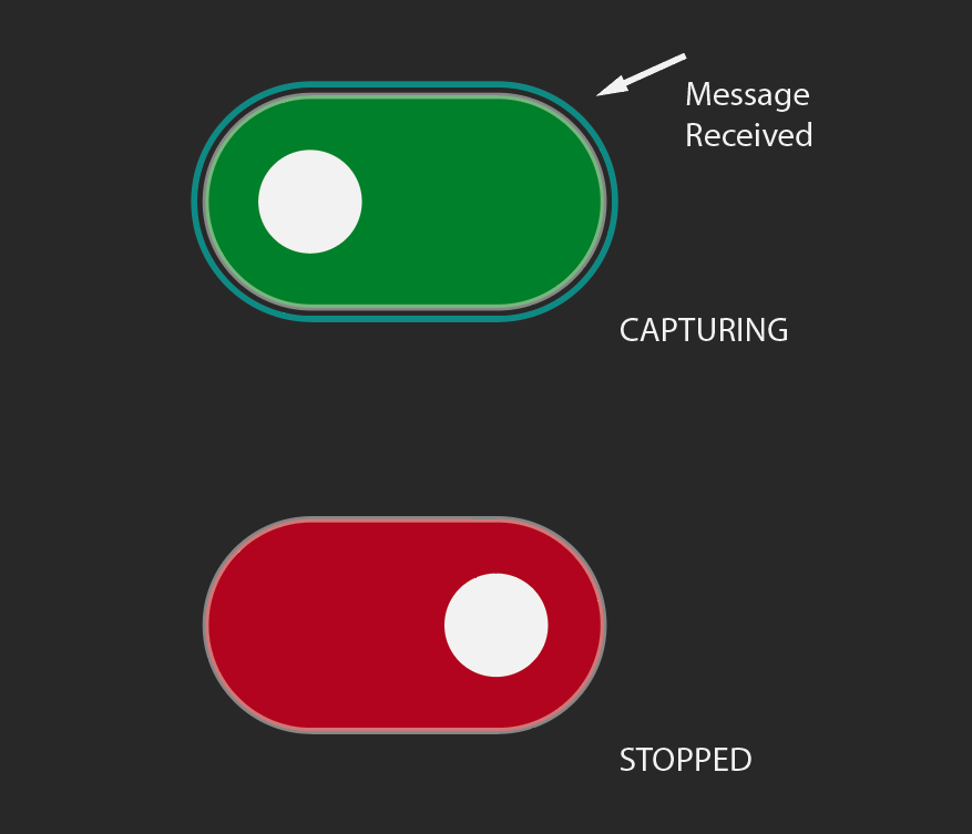
If you look closely, it introduces visually an OR-OR condition. This is very different from the ON-OFF state. People who work with interfaces know this. That’s why I said that such elements haven’t appeared in interfaces for a long time. It’s a push to understand exactly what this switch does.
To be honest, I prefer the version with the circle switch (just add the “Logging”/“Stopping” popup). And the last version is only suggested to satisfy your taste.
@sebl
Yes, and I thought about that too (optical size) in the current button, no wonder, right?
But then you want to notify user somehow that the new message came in, so for now the dot is getting bigger when the new message arrives. Unfortunately it is not working that well, so probably the circle won’t pulsate, but something else should happen.
So you say, that the dot on left/right introduce this visual or-or condition and makes the whole thing disambiguous and it is then ok to press red to start and green to stop?
What do you mean? The button is to enable/disable capture.