
Yeah, I know, I was just glad to read it, because I had the same thoughts when I drew a square and a circle into the button.
That’s what I think. I want to make sure that you do. But you can disagree with me, I understand.
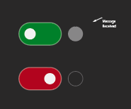
You just said that the circle in the button reacts to new messages in the logging system. I think the button should have only one function. And if another, somehow assigned function interferes with the redesign of the first, then it is certainly worth abandoning it in favour of rethinking the first.
No disagreement at all, I know that the current state is ambiguous and I like to hear ideas. I’m just not that sure, that green/red switch with just a single dot on the left or right will help. Let’s see.
The button has one function: to enable / disable. It has an additional visual feature, to let the user know something has happened. This visual cosmetics doesn’t interfere with the function of the button. Like the outline you’ve proposed. Yes, maybe it should be the outline. Let’s see.
Don’t get me wrong. Interfacing has a language that has been established for decades. It is an art and a science, sometimes even more complex than programming. I really appreciate your work, the new logging system is great. You are doing a great job.
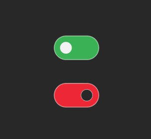
I see the problem in the chosen interface solution:
-
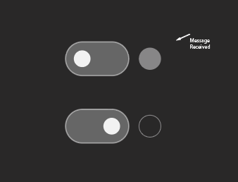
If you want to set the state “ON-OFF”, you have to consider a number of classic solutions.
-
If you decide that it is important for your interface to set the state “OR-OR”, you have to choose between other solutions. It’s not even about colour. It’s some subconscious intuition, already established in interfaces like the IPhone. You can even remove the colour, I just left it because that’s the way it was originally.
-
Placing more than one function on an interface element may seem clever, but in most cases it is not. This visual message could probably be elsewhere. I suggested a possible solution. It might work. For example, the outline could become brighter, or the circle itself inside the button
Trust the practice of people who have worked with interfaces before you. This is a textbook case.
Once again, I love what you’re doing. It’s amazing.
Also think about the fact that Red and Green are indistinguishable to about 5% of the globe. I personally know a few of those people.
@robotanton look for example for this:
In this way, you can establish a clear visual language and reserve an element for the “message received” event.
@yar
Thank you for your words.
There are just different scenarios for using the interfaces, one is playing with iphone and another one is being in a critical situation during the final stages of the project where you want to have some info shown at your face, because otherwise you won’t notice it at all. And I would argue, the logger that is not logging is important info enough to give it a color. But you are right, red-green are probably not the best choices. And probably there should be another notification telling the important info.
And sure, an extra dot notifying about the new message was there in the previous iterations, but was disregarded for now because of lack of space.
And what is what here?
I’m just suggesting options.
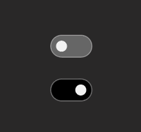
This is not the best option, it might be worth swapping the circle inside. But the button itself makes it pretty clear that something is working or not. Once again, we need to separate indication from behaviour. I basically agree with your position - the indication should clearly give OR this state, OR the other. But switching between these states should be done differently than it is now
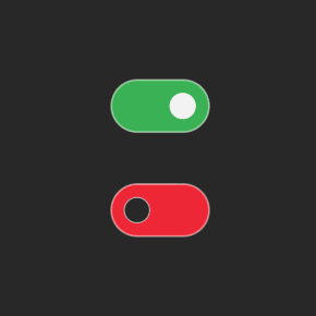
Probably this better (with color too)
If I don’t see a bright spot (maybe coloured) in the logging window, I react immediately. What do you think of this interpretation?
another idea:
1 Like
Thank you for your suggestions and the time invested.
Sure, but the LogUI has many colorful spots (for reasons) because of different severity levels.
So try to put your (gray/black) switch into the window full of log messages having different sevlevels.
I guess your eye won’t see immediately if the logger is on.
Yes, I like your last green/red switches with white/black dots.
1 Like
First of all, thank you. I really appreciate your work and your patience.
1 Like
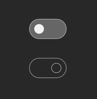
Isn’t the ON state usually on the right side? This image is confusing me…
1 Like
@tonfilm I’m not sure, but I’m more likely to agree. The main thing is that overall visual language has been found.
It’s like I like the first option better
1 Like
sry for chiming in late…
keep in mind, that 1 of 12 males are affected by red-green blindness.
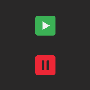
in case you want to check how this issues is solved in other software:
firefox webdeveloper tools network tab
default is capture on
icon is a pause button without accent.
if you decide to pause, it shows an accented (green) play icon
chrome webdev tools network tab
default is also capture on
icon is an accented (red) stop button
once stopped, it changes to unaccented record icon.
i personally like the firefox solution, which shows the default behaviour unaccented and only highlights the changed state.
both solutions only use color for one of the two states to avoid the red/green issue.
2 Likes
yep, mentioned that before
Can you provide screenshots?
Firefox active:

Firefox paused:

As you can see on my machine the accent color is blue, guess it’s a system / browser setting.
1 Like
I am not sure if it is better,
Still a bit controversial:
As you can see on my machine the accent color is blue, guess it’s a system / browser setting.
Ah! did not think about that, seems like firefox is using the system accent color.
anyways, still the same principle applies, that only one state is accented. which is imho is a good hint on what is the normal (default) state and what is something i as a user have actively changed.
since it’s a log window i’d assume the standard behaviour would be to capture any incoming message. just like the debugger network tab logs any networktraffic by default. unless i stop it because i want to inspect some detail.
2 Likes