Since one of the original posts by @sunep never got any replies and it doesn’t seem to be fixed, I am reporting it again:
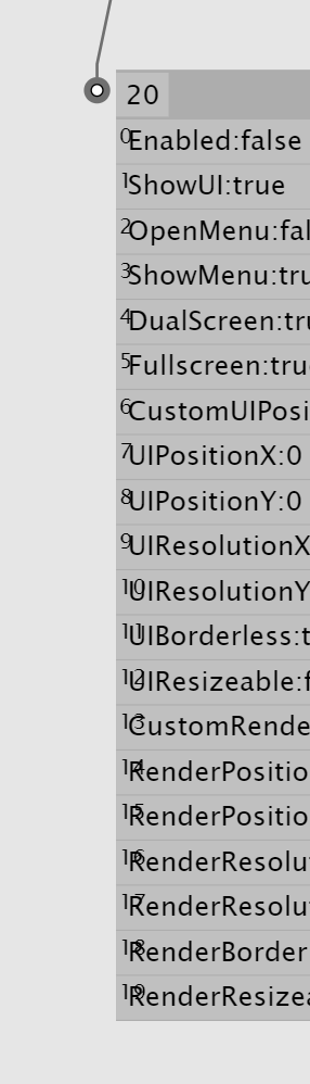
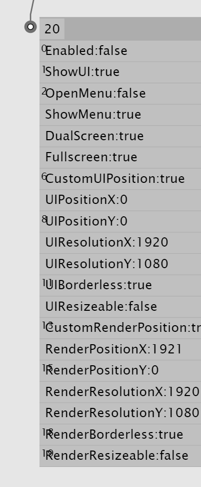
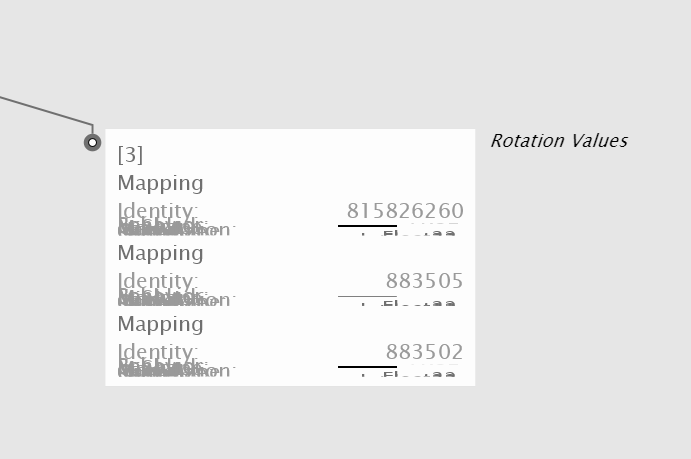
The Entry Index in IOBoxes is always overlapping the text, so is kind of pointless or at least looks bad:
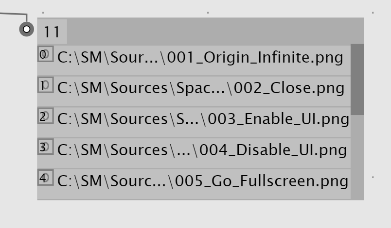
I also noticed that if you click on one of the entries, the corresponding entry index simply disappears:
Lastly, and this one is very annoying:
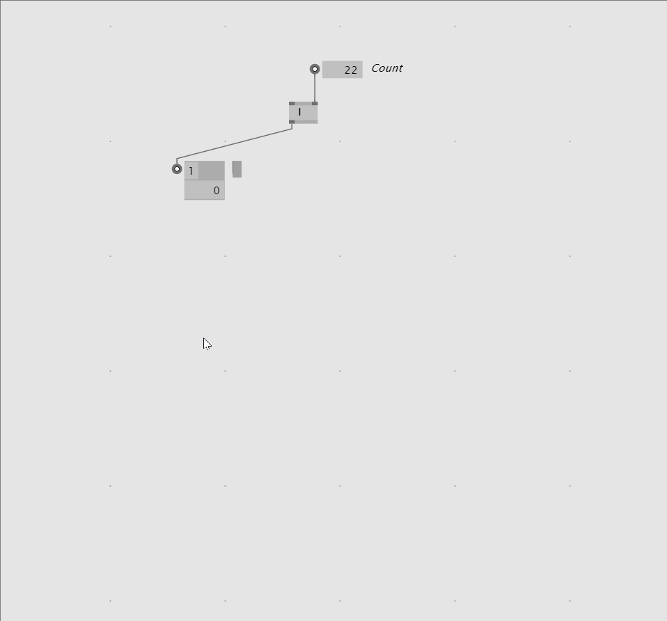
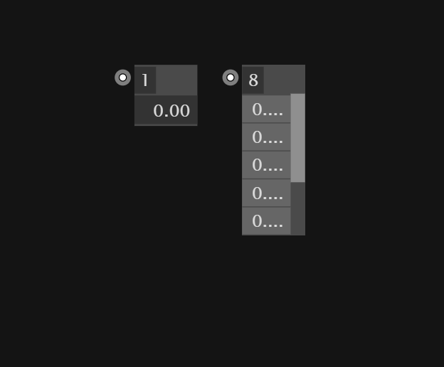
If you change the number of visible entries in an IOBox, then copy and paste that IOBox, it will always default back to showing 5 entries. Then you go to customise it and it still has the old number, but you need to change it once for it to update:
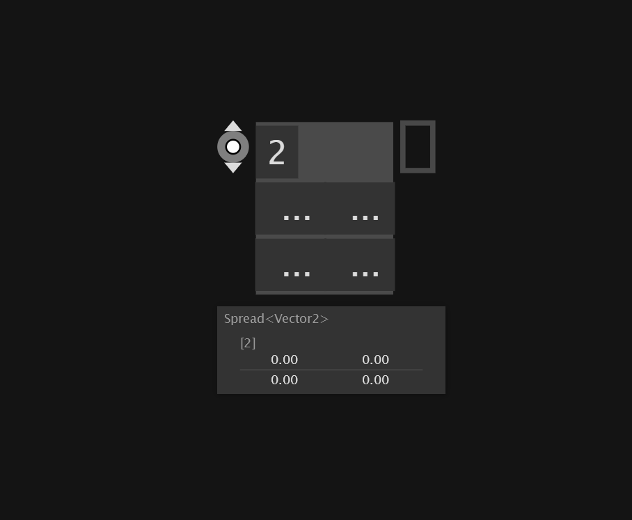
Would like to add an other inconvenience that is the initial size of IOBoxes which often is too small to fit the contents. Like that freshly created Spread of Vector2:
I hope the UI gets some more love in the details, not just the big stuff. This is all stuff you notice like an hour in from ever using vvvv and it’s not a good look. First impressions and all… ;)
In a string IOBox, can you make it so we can scroll a long string with multiple lines, please.
Normally you for example paste in a large string and then you always have to resize the IOBox till you think you see all the text and then make it smaller again.
It already does word breaking horizontally, although I guess having a horizontal scrollbar if needed would be better, so you can actually tell where the line breaks are in a string.
Vertically there should certainly be a scroll bar if the string exceeds the bounds of the IOBox, similar to how it does for a spread.
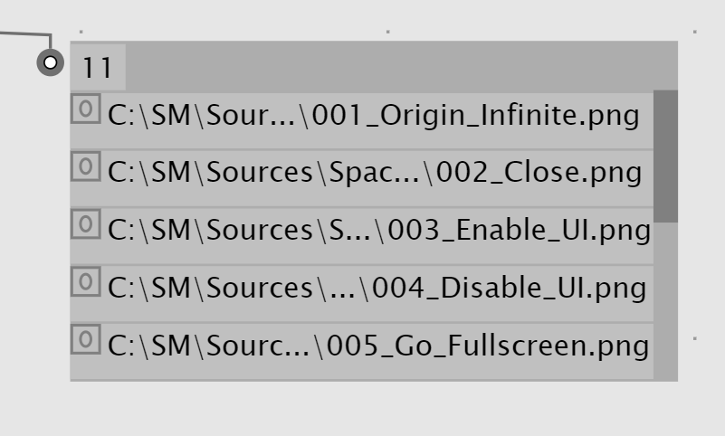
If you have an output IOBox with a spread of paths, there is this little grey button(?) added to the front, which opens the file in the path if you click it, which is kind of neat, but also not obvious at all.