since pixelsmith commented on some problems of the vvvv website, i try to collect some issues i see / seen in the past
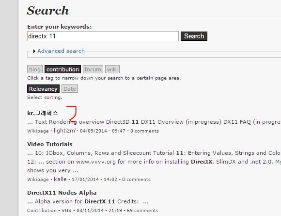
search engine
still seems to come up with interesting results, if you don’t exactly hit the keyword, you have trouble to find, what you were looking for, try “direct-x 11” … korean contribution ?
download page
main entry point for beginners. i appreciate the recent work there but its too complex. no clue what to look at first. there is so much text and things to click: alpha/beta, wiki options underneath the headline, descriptions, addons, 32bit, packs …and the shoutbox on the right. just take a step back and try to see it like someone who enters this site the first time. compare it with the processing download page
gallery
still just a big pile of things getting lost in no layout
forum
i’m still not in love with a tag based forum. things get lost if not tagged right. and ppl do not use tags if not guided by an interface. in a traditional forum you would click a category (i.e.hardware) and add a thread…hence ‘tagged’ by interface.
the attitude “everything you know is wrong” is not always the best way…escpecially when it comes to interface design
i see the effects of this every day in uni, even students who get hooked with vvvv don’t use the website since its a frustrating experience. nonetheless, i promote the website!
{img src = “VVVVSEARCH.jpg”)) title = “slit scan”}
Sorry a bit off topic but I found it funny.
Not much critics on the webside here.
For the complexity of this whole subject vvvv I think the webside is doing its job pretty good.
Pro is that there is a lot of space for community to evolve.
A contra arguement to the sub category based forum that you proposed is that some parts of the forum just doesnt get visited as much as others. This way also less answers appear. But I aggree that it is a huge mess.
Also contribution page should have a sort by date (of creation) and sort by user etc… It total sort by date or user could make so much more accessible. And probably more sort by options
i too think that the website is not too bad… remember the old one? (i always use google instead of the search field)
but i think, there’s one killer feature (that is already laid out) but seems to be not working since the relaunch of the page:
backlinks in Node Reference
if you look here for example: filestream (dshow9) or simply click a ‘Node’ like filestream-(dshow9) you should get directed to the nodes reference page.
but unfortunately, this page is crazy useless in the most cases. I can read the Pinnames by myself ;) the filestream here is the single exception i found in a quick search, where there’s at least one backlink reference filed under related discussions.
So, if every node link would create a backlink like in the filestream example above, i think a) this Node Reference will get its right to exist and b) will make a really helpful source, that links all the forum posts etc. to its related Nodes…
And there’s even a chance to find out things about a node you didn’t exactly search for.
i also think that this feature is aswell for beginners as for pros.
beginner-case: “huh, that node’s not doing what i expected… if the helppatch doesn’t bring me further, let’s check the reference and see what people are talking about that node”
pro-case: “hm, there was this thread about this nodes usecase/bug/behaviour/… and if a search doesn’t reveal this thread, the reference might do”
@search engine:
true the drupal-module we’re using here is broken ever since:
mostly bugs when you’re using numbers in your search-term
seemingly daily random false results. a search-term that works one day brings up wrong stuff the other.
this is totally not cool webmaster didn’t yet see an easy way around it.
@backlinks:
thanks for the reminder. i just put that back up on the list. a system like this is in place only not accessible to everyone yet. so atm i am the only one occasionally setting those references…
yeah a working node reference would be reaaaaally great! especially for contributions.
pressing F1 in vvvv opens the help patch. imagine another shortcut that opens the node reference on vvvv.org and then show all related discussions in the forum or contribution page. this would channel all discussions in a good way and nothing would be forgotten after years.
I have to remove everything past /activities/ to get content back.
I’d suggest also to check preview rendering with actual rendered content.
These are the two previous internal URLs within non-parsing syntax: in preview they are correctly rendered; not when saved.
@anto please provide an example. we’re not aware of a problem with this. if you simply paste a link and leave a space before and after it, the link will be recognized as such and displayed accordingly. sometimes in the shoutbox people don’t leave a space before and after which leads to corrupt display of the link.
works. i also just pasted that link. so seems you capped the last part.
but otherwise true, sometimes some specialists use strange characters in their thread-titles that can break such links. iirc using a + in a thread title is not a good idea.
