I just enlightened myself realising that the names on the top of the VL editor are actually tabs and I can navigate between them by left-clicking them. I thought this part of the UI was some kind of breadcrumb element. And until now I was wondering where all those previously opened documents were gone when opening another one. I’m relieved to know that these things are only tabs and not something else I haven’t understood yet.
TBH, I’m finding the current super minimalist design of the VL editor hard to understand and often confusing. At the moment it is rather non-explanatory.
Is this still under development or intended? Have you user-tested the designs?
I would love to see the UI closer to very well established UI patterns. E.g. the current layout of the tabs could be improved by dividers between the tab names and a clear highlight of the current tab in my opinion. Generally, in VL, it’s unclear if the UI elements are global for VL or if they belong to the current document. Some visual dividers like lines or different variations of the elements background color (even another grey tone would work) would help a lot I think.
indeed the tabs will get an overhaul at some point. our plan is to test an even more browser-like experience for navigating between patches. some will not like that because it will not be following the well established way of navigating documents in other development environments and it will therefore be argued to be confusing. we’ll give it a shot anyway because we think it could be much quicker to work with. and while at it also the looks will likely be adapted a bit…
this is adopted from good browser behavior: middleclick a link to open it in a new tab, middleclick a tab to close it (which also works in many other programs that use tabs).
Sounds interesting. I’m looking forward to it and happy to give feedback if you are interested.
Do you have a rough timeline for that? I think it would help users picking up on VL a lot.
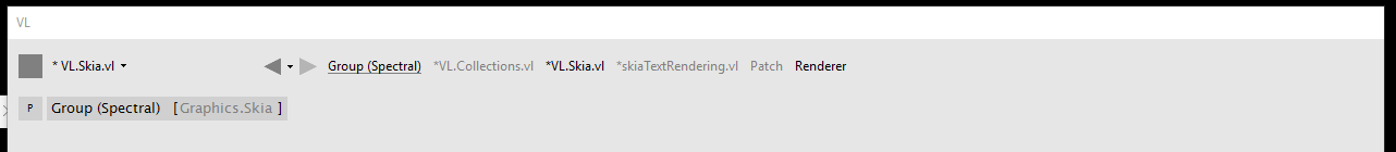
I think the UI pattern you chose itself is not confusing and doing it more browser-like won’t hurt much. I think most important is that the UI elements give clear hints on how they work and how they are related to the rest of the UI. The screenshot I posted earlier does that for example:
I’ve just learned something new, thanks. :) I’m probably working too much on macOS without 3-button-mouse to have recognised that before. I knew the opening middle-click but not the closing one. Yeah, I guess it can work well if it’s clear that these are tabs.
I agree with @jerry. The usability of vvvv and VL has to be up there with the most minimalist and least intuitive in software design. Sure, most of it is intentional and part of the charme of vvvv and its ethos. But especially for people who are new to visual coding and vvvv the learning curve just for the UI is rather high.
I don’t think that the argument that “a few people will be upset” should ever inform decisions for usability. User testing and/or best practices and known patterns are the only way to achieve good usability. A few tweaks can go a long way and there are of course ways to keep the old patterns but add some alternative ways to achieve the same. Like the tabs; you can keep the middle-click-to-close pattern, but maybe add a little x icon to close it.
I think it very much depends which development environments you consider to be “well established” and in some way comparable to vvvv. If we are looking at visual coding tools then the ones to consider are things like MaxMSP, Quartz Composer, Grasshopper or other node based enviornments like in Houdini, the new Cinema4D or Unreal Engine, all of which have a vastly more polished and less minimalistic approach to UI.
I believe that vvvv should stay true to its roots in some regards, but in terms of usability and UI I don’t think anyone would complain about some changes in the long run.
As some clever person once said “A user interface is like a joke - if you have to explain it, it’s probably not that good.”