bjoern
April 2, 2019, 8:05am
1
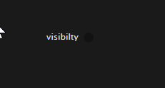
When using dark pads are barely visible. Same goes for those little arrows signifying an upstream or downstream connection on pads and IO-Boxes.
And the navigation in darkflat .
Could just be my screen(s)…
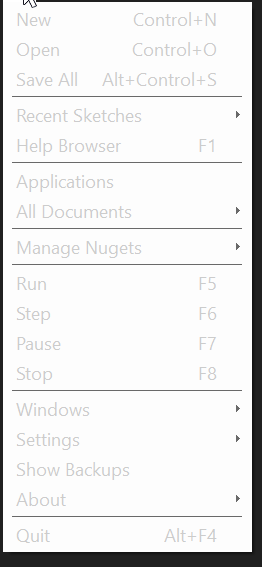
The top left menu looks somewhat deactivated in darkflat
thanks, noted.
oh no I’m digging the dark look, patches now look h4x0rz
the official dark theme is still the default, there was a second experimental darkflat.css shipped, it got removed in latest builds. it will be back once we fixed all glitches with the new css format and then everyone can start building their own, if they want.
bjoern
April 4, 2019, 2:07pm
5
When a node is selected its pins are hard to spot.
bjoern
April 4, 2019, 2:13pm
6
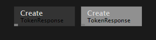
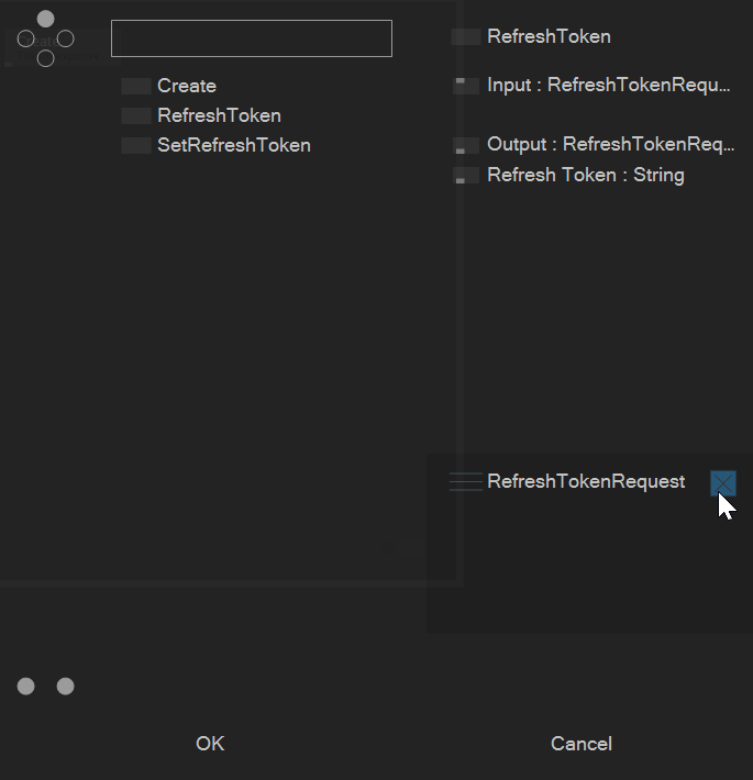
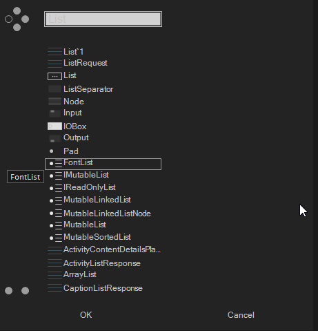
“Close buttons” in nodebrowser could be more prominent
1 Like
gregsn
April 4, 2019, 7:38pm
7
close buttons fixed for upcoming
2 Likes
joreg
April 10, 2019, 8:35pm
8
thanks for reporting. build 177 should fix all those, see: https://vvvv.org/blog/vvvv-gamma-2019.1-preview
bjoern
April 15, 2019, 11:34am
9
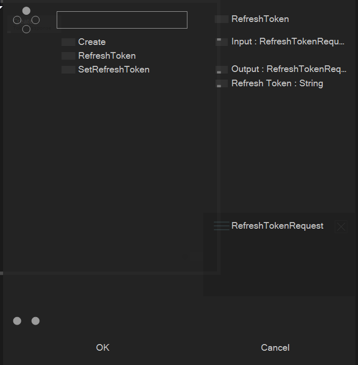
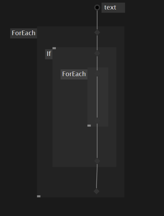
Accumulators & Inlets/Outlets in nested regions.
1 Like
joreg
April 15, 2019, 5:52pm
10
bjoern
April 17, 2019, 9:25am
11
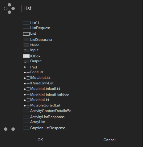
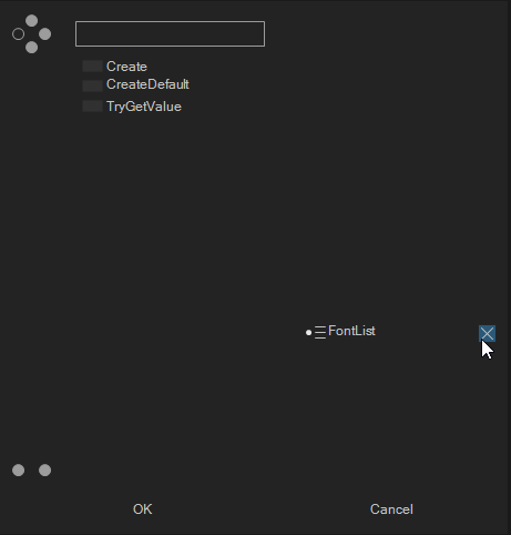
Searchfield of Nodebrowser after “closing” a previously selected category.
system
April 16, 2020, 9:25am
12
This topic was automatically closed 365 days after the last reply. New replies are no longer allowed.