Making nodes and links less proeminent, aka CTRL + H

Hey there,

Never used the CTRL + E feature much in beta, but its CTRL + H friend was super cool for documentation.

I basically read it as “this node is there, but please don’t pay attention to it” or “I just need to distribute this value to multiple places, but also don’t want to clutter the patch too much”. And this is fine : we tell the user that we actually connect something to multiple places, but just don’t want to make a fuss about it.

Would be great to be able to express such a thing in gamma. Sometimes, help patches end up being cluttered and scary because you need to connect something to multiple places. This steals attention from the viewer.

But now that “half transparent things” actually have a meaning in gamma, just dimming the link could be confusing. What about making it thinner? And most importantly : do you patchers also feel a need for it?

Cheers!

5 Likes

I often use pads for non-time critical data types to avoid too many lines. I would also appreciate a feature like that.

Sounds like this (again):

2 Likes

Just adding a usecase here : in GammaLauncher, I have a Channel<String> to which I push debug messages during the download process. This means that the same Channel shall be accessed from many (many) places in the patch.

Since everything is on Create, storing that Channel in a pad is not an option. As a consequence, you end up with this monstrosity

image

which makes it super painful to maintain. Making the link “less visible” as I initially suggestion would not help here : it would always get in the way when patching.

An invisible link that that is “just” an invisible link, without any implications, would definitely help there :) @tonfilm’s suggestion from the post above mine sounds like a good idea.

Cheeeeerz

Why not use some sort of singleton pattern, like locator or repository, also I don’t really see a point of passing channel instance around. E.g. you still have this sort of a class where all the channels stored and it’s a singleton likely, so you need to create some explicit class like Channel<MyExplicitWhateverClass> so then you theoretically don’t need to know exactly witch channel instance you need just whatever message coming if it’s typeof MyExplicitWhateverClass you fill your logger instance

Here I guess you need CTRL+G more than CTRL+H

I see inside LaunchTabRuntime everything is really tight, it should be possible to refactor UpdatesTabRuntime this clean as well.

Also you could inject all those Channel to UpdatesTabRuntime on Create so you would get an input pin which you could copy around the patch. Looks like this is what you are doing for ScanLocalVvvvVersions.

Antokhio suggestion seems right as this is what I would do but not with a Singleton, I would personally prefer using a Service class.

Not familiar with those but happy to have a look!

So there would be this class holding all Channel as properties, and a generic SetValue operation that, based on some type check would “know” what Channel to write to? Am I getting this right? Sounds interesting.

When chaining multiple requests on Create like I’m doing here, I’ve had issues in the past when refactoring stuff to different process nodes (the chain of operations would interrupt at some random point for no apparent reason). Which is why I keep everything on the same “chain”, which is terribly ugly but has worked 100% of the time.

Also, ForEach [Reactive] being statefull, I could not use static operation to visually group stuff. @tonfilm didn’t you tell me once that Select [Reactive.Observable] would be the stateless equivalent of ForEach [Reactive]? Since Reactive.Observable regions never finish, does that mean they’re only meant to be used on Create?

Indeed, feeding that Channel from the outside would allow to use a pin instead.

… looks like I have to brush up my patterns :-]

Thanks for the suggestions guys!

1 Like

@sebescudie here is repository pattern reference Service Locator Pattern in C#: A Simple Example Stefano Ricciardi

I have a suggestion for UI if hidden links ever come to gamma.
Inspired by sewing with the idea that the thread is going ‘behind’ the canvas.

HiddenLinkUXSuggestion

4 Likes

Here is an alternative with square instead of circular aesthetic.
Circles are perhaps too easily confused with pads.
Square is similar to input/outputs which themselves are kind of ‘just links’ so perhaps this is better.

HiddenLinkUXSuggestion2

While I really appreciate this “fourth wall break”, I guess this goes against so many rules of interface design :D Bit I did not study this officially, so if I am wrong, I stand corrected.

In terms of breaking a hidden set of rules: The question is who is the interface for? This isn’t end user interface design.
It’s not the goal that every single VL patch is universally readable by every single VL coder.

You would only hide things as a programmer when you personally choose not to see them any more. In that regard I don’t see how hiding links (or nodes as you could in beta) is much different to collapsing a bracket in a text code editor.

There are cases where “universal” code readability is a priority:
-If you need to make code where you collaborate with others then you should agree what you hide or show (and also your comments style etc).
-If your code is part of a tutorial or helppatch then of course you think about what you show so the other coder can learn.
-If you make a public library AND you consider others would collaborate via pull requests etc
But I would say 90% of my paid coding work is code only I will ever really engage with.

Why not use other strategies to prevent spaghetti patches?
Because while we see spaghetti patch as messy, the computer doesn’t necessarily have a problem with it.
A little spaghetti might be the best (and fastest) way to describe the task to the machine.
The problem may not call for additional software design patterns just to clean up the mess.

This screenshot looks a lot like my proposed way of dealing with this. (See the GitHub issue above).
The idea is that you can use Input pins of the same name all over the place. This already is established to get rid of some of the annoying long links.
The only missing feature is to be able to feed such an input from inside the patch, which would make it disappear on application side.

2 Likes

Given patching UX is a topic at the moment I wanted to bump this thread again.

Would totally support the Var proposal on GitHub but would also just support having style control of links - make them invisible, curvy, coloured whatever.

Ultimately for me it’s about the patch being a visual description of some code I want to communicate to my future self and collaborators.

This would give me more tools to highlight the important parts and hide the boilerplate.

3 Likes

Oui oui oui (though colors and dashes might clash with operation assignment/mutability, but more “styles” would be great).

2 Likes

Posted this on Github too, but thought it may be better placed here for discussion:

This is a very interesting topic that plagues every node system:
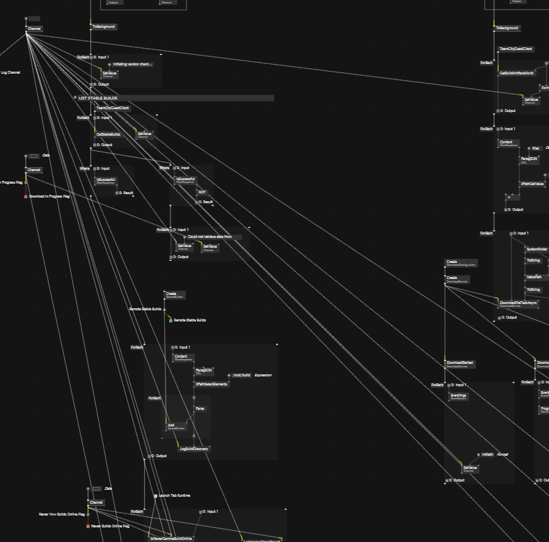
On one hand, having the links helps a lot with making clear what goes where and what is what - in a way it’s the main point of a visual language, on the other hand, the links themselves get in the way fast, and creating elaborate layouts with them is a pain to maintain.

One idea I had in the past was, to have a kind of a 2.5-D canvas metaphor, where you can put longer cables/links “in the background” (under the floor, in the wall if you want an image), but make them more prominent with a shortcut. So a kind of “depth” so to say, that still allows you instantly to see where things go.

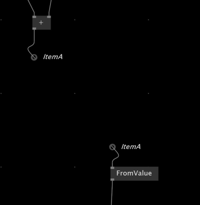
I always imagined the links to look a bit like holes (bigger empty circles) with the link going into them halfways to suggest the “underground” nature of them, similar to TobyKs screenshots above.

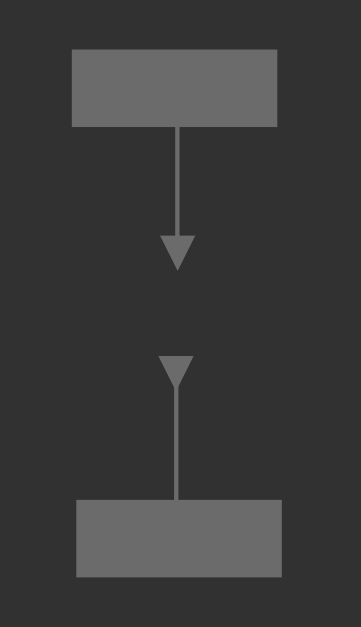
Or they could be triangles (wich is unused as a symbol in VVVV ATM AFAIK) and could be pointing “outwards” for the “inputs” and “inwards” for the “outputs” like this:

image

One thing some virtual patching environments use in a musical context is, to make the links fully visible at the ends but fade the center out to something rather subtle when they are longer than a certain threshold. That does not solve the issue completely, but makes it at least less prominent and much easier to ignore.

Another solution I saw in such environments is to only make the links connected to currently selected nodes fully opaque or highlight them in a specific style to make them stand out.

I personally think that having a way to make visible where things go is important, since like with the current pads, it can be hard to track down where stuff goes otherwise or it needs a search, which is pretty disconnected and awkward/non-visual for an explicitly visual language.
Then you are back to variables in code and lose the instant visual flow…!

This could also do away with having to name them, which in itself can become a pain when you have many of them.

Cheers,

Tom

I totally support the suggestion to have invisible links, but I don’t think it should be solved by a metaphor of a link going to the back of a patch.

It clashes with the metaphor or the definitions being the back side of the application, which is already well established as an introduction of the definitions side, and I think every one who is teaching VL and vvvv is using this metaphor.

Well, on the other hand, invisible links with no way to make them visible go very strongly against the grain of a visual language, metaphor or not (forget the metaphor if you don’t like it).

I personally found it a pain to track down pads in example scenes that make heavy use of them.
As a beginner, they feel totally disconnected.

And when I tried to use them myself, after about 10 of them it started to feel awkward, both in cluttering the node browser and in coming up with clear and unique names in a node browser that already has a million of nodes.

I’d love if I could see the connections if I select the pad.

Select a pad, hit crtl + f, “step through” pads by hitting return.

1 Like

Thanks, but that is only slightly better than searching for them, if at all.

The whole point of VVVV is the “visual” part. If it goes too far back to a code editor (where I would also do a search or step through “where is this variable used” kind of things) then it is leaving behind it’s main reason for existing.

Gamma is already rather heavy on the not purely visual side (compared with Houdini or Tooll3 or Cables.gl) so IMO it is a dangerous slope to go down without having ways to get things back into the node/links/visual side.

A shortcut to “reveal” hidden links could go a long way.
As could showing links when a pad or “local variable” is selected, which I find the more organic way, since I don’t need to remember even more shortcuts.