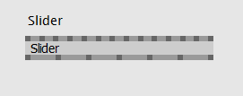
DPI awareness seems to work fine now but font choices/settings doesn’t seem optimal for readability - specially the names on some nodes are hard to read due to very small letter spacing. Default IOBox font and pin names etc are better.
Maybe it’s worth considering a monospaced font or at least tweak font settings a bit for readability (or make it configurable…)?
See attached image where the letters of the Slider node and IOBox are similar in size but the letter spacing of the node makes it very hard to read.
when you see the comforting green in a thread it means we closed it. when you then find new evidence we’d appreciate if you start a new thread instead of disrupting the comfort. i removed the flag for now to confirm that this obviously still needs some fixing. and as always thanks for the pointers thats what we alpha for…