Edited to make it clearer I’m proposing both together.
I saw a few UX threads lately and I thought I would jump in with two proposals, ideally would do both.
Problem
When patching inside regions you can connect pads and inputs that belong to the canvas.
If your node is not near the top of the region you currently must choose between
Messy: Put the input/pad on the side or above with a weird link path.
Unclear: Put the input/pad directly above the node but keep it on the canvas behind the region. At a glance this is confusing and it’s very possible to accidentally include the input/pad in a region context if you ctrl-drag when you create further sub-regions.
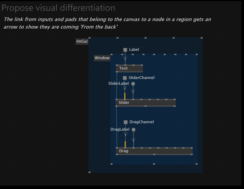
This kind of problem often comes up with ImGui because it typically involves vertical patching inside multiple regions.
Visual differentiation on the link when it connects from a pad/input on the canvas to a node inside a region.
This allows you to put inputs/pads in the best position for a clean patch, whilst still making it clear that the data source belongs to the canvas context.
This is only necessary for inputs/pads that are actually connected to nodes inside regions.
Here is a suggestion how it could look like
Proposal B
A toggle in settings that automatically exlcudes inputs and pads from ctrl-drag operations.
If a canvas pad/input is connected to some nodes you typically don’t want to change that context if you control drag the nodes into an IF region etc…
Then you can happily ctrl-drag such arrangements and inputs from canvas keep their correct context.
I always imagined that the patch element - which could be a pin, pad, or node - that visually ended up in the region, while not actually part of the region should have a border/background color making clear which “level” - region or top-level patch - it stems from.
@gregsn sounds good in principle, would love to see it.
I considered something similar, but because of the existing fill/stroke behaviour to indicate compiled/not compiled, generic and manual typing I thought it could be confusing to add more borders to the elements themselves.
I also thought colors could be confused with error and operation colors for links and elements.
In my own experience it’s almost always the canvas-level elements I need to link into regions.
Once I need to link from a 1st level region to a 3rd level region then actually this is so visually confusing it’s worth to use dedicated process nodes.
I should clarify… I am often linking from 1st level to 3rd level regions using vertical linking. But not from a element that needs to live behind the 3rd level region.
Sure. I just wanted to mention this alternative.
The main question is if this style of expression shall ever be considered “neat”.
If yes, then your approach would already hint to the user to pay attention and double-check where this pin is from.
My suggestion comes from the thinking that this should not be considered a neat patch and that you want to get told by the UI that a certain element is part of another level. You see it on the element itself and not on the link (the arrow visually might be further down).
In rare cases, a node is not even connected and has side-effect and you want to see that it sits outside and not in the region.