Very nice to see development here!
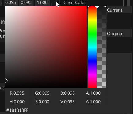
First things I saw was that the colour widget now has a slider for the alpha value. Since that struck me as oddly missing in the previous version, this is very welcome! :thumbsup:
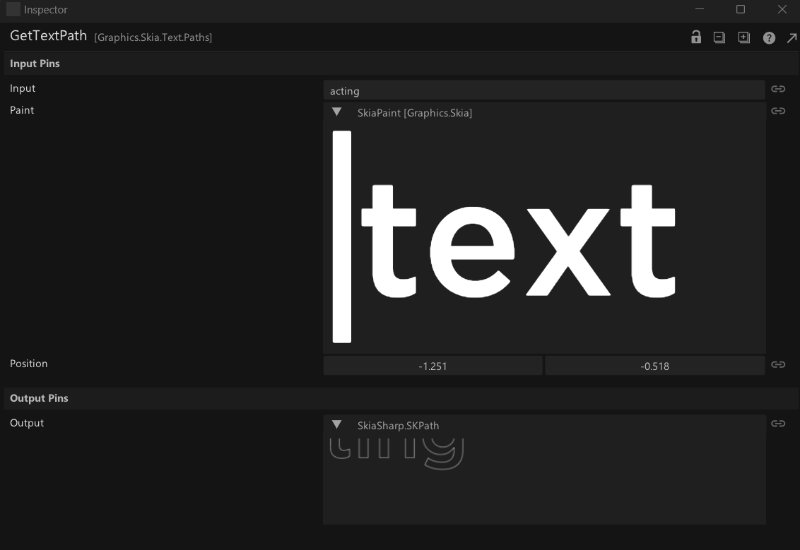
It’s also cool that incoming values now can be shown with full detail!
Even texture previews - very very nice!
Would it be possible to allow values in this preview to be selectable for copy and paste?
^^^ Like if I have a colour incoming and would like to copy the hex code to paste into another node?
BTW: In this context: is there a deeper reason why value pins/pads don’t show up in the inspector? Especially for colours this would be super helpful!
++Especially++ since they become unusable with lower alpha values:
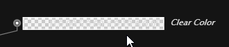
Copy-pasting colors into these via inspector and using the larger, more intuitive colour widget there would be super nice.
What do you think about a preference inside the Inspector, to always expand entries by default?
I see myself hitting that expand all button a LOT :-)
I would have unfolded as preference right away! :-)
Would be great to have it directly in the inspector, so it is easy to reach if it needs toggling (as compared to a global preference).
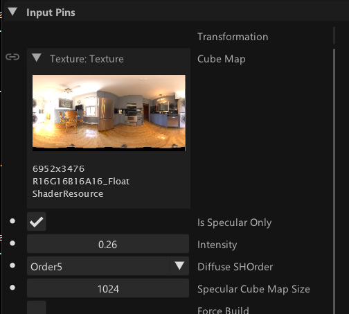
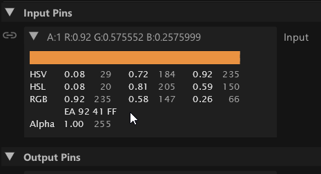
What bothers me a bit in the unfolded state is, that the labels are taking up a ton of space while the entries are often truncated. I’m not sure if there is a good solution there, but maybe the content could be full width in the unfolded state? For example:
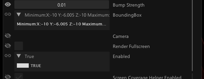
^^^ The bounding box values are truncated and the unfolded parameter doesn’t offer more information, although there is all this space on the right. I don’t know if that would be possible, but having the unfolded area full width could solve that without having the inspector very wide.
Even more extreme example:
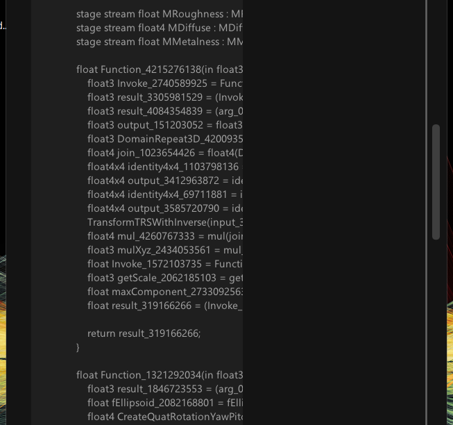
^^^ This is the FUSE code view, and it would be awesome to see that full width in the inspector.
Having things full width could be a major benefit of the unfolded view!
^^^ A ton of wasted screen estate there… ;-)
One thing I find maddening in VVVV is, that in the patch area value changes are done with the right mouse button and up and down drag, while in the Inspector, it is the left mouse and left and right drag.
Even after almost 2 months, my muscle memory is constantly frustrated by that and I watch my partner with shared pain, trying to change values the wrong way around constantly.
Each way of doing it makes sense in each area on it’s own, but in combination it is super frustrating.
Now I wonder: Since the right mouse doesn’t do anything in the Inspector AFAICS, would it be possible as a kind of “catch all” to allow the change of values with the right mouse button and up and down dragging, just like in the patch editor?
That would take a LOT of pain out of the usability department IMO.
Would the framework allow for docking of the inspector? I have it constantly go missing behind other windows or need to reposition it. For me it is a.) open all the time and b.) an absolute integral part of the main window, so having to manage it separately feels somehow odd and “disconnected” in the most literal sense. :-)
I have no issue with additional inspectors floating, I just think it would feel way more “aus einem Guss”/integrated if it would form a unit with the main window.
Will have to work more with it to see how it feels, but superhappy you are working on UI/UX!!!
Cheers,
Tom