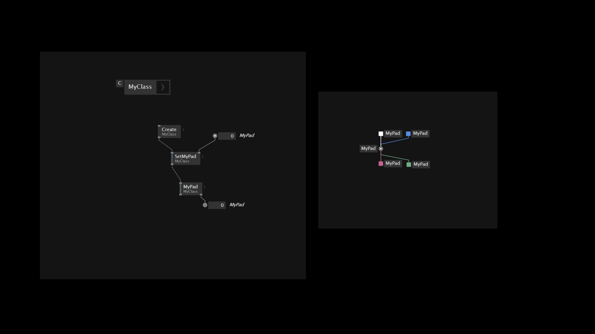
Taking over from Color for Process this is still relevant, I have even seen a situation where 2 different operations attached to the same Pad had the same color, very confusing, color should also be, if not arbitrary, at least static.
As a feature request I would propose a color hint on the Operations’ nodes.
That would be very confusing for someone consuming a library and who does not care at all about what’s inside.
Yes that may be true, a setting in the Class/Record then? Show/hide color code on nodes ?
If colors are revisited should also remember usability for color blind users.
Colorblindness Usability - vvvv gamma / feature - Forum
It’s always going to be difficult to find 10+ colors that are clearly distinguishable from each other.
For both these reasons usability shouldn’t rely on color entirely. If color is not a reliable way to determine operation, then you can currently scan with tooltips to determine operation. But this is laborious and not an ideal way to get a birds eye view of which links are on which operations.
Solutions:
- Could explore other kinds of link styling path effects eg dashes, double links, numbers, arrows, etc
- My personal approach is I put all major operations except getters and setters in their own labelled frame. This relies on the user of course. Will show this approach in a tutorial video I’m going to push this week.
- Could have a UI option that automatically draws frames around operations and labels them. Will look weird on the typical getters/setters cluster of operations but would at least quickly highlight if you have more or less operations in front of you then expected.
I agree we need some more colors than the 9 there are currently. It leads to you having different operations next to each other that have the same color.
Also the dark red for dispose is so dark in light mode, that you actually can’t read the text.
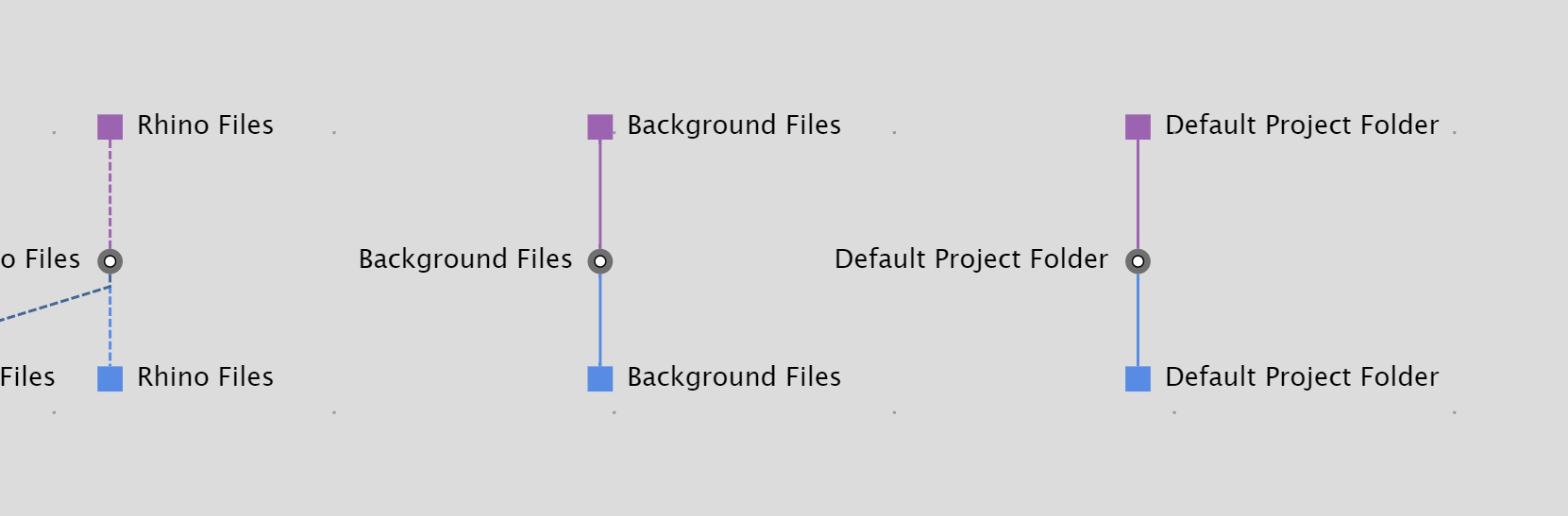
That last blue pin is actually a different operation, but it has the same color as the others.
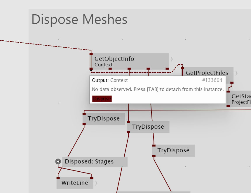
At least on my monitor I can not read the “Dispose” text at all. I basically just know that the almost black looking links are for dispose.
So yeah, some color tweaking and some more color options would be very welcome.
the fastest way of enhancing the color palette (before thinking about even better ways of distinguishing as tobyk mentioned) would imho be to just use the palette of one of the big design systems out there.
- primer (github) palette
- material design (google) static palette 2014
- spectrum (adobe) current palette
- fluent (microsoft)
- carbon (ibm)
…
they are all very well researched and tested, and mostly provide dark and light scales, high contrast and even colorblind optimized.
the common solution to tackle more colors than defined by the palette base:
after having used each primary color, start picking an available shade from the scale (of the same base color) with as much distance as possible.
of course contrast also starts degrading the more shades are used, but at least this way the contrast is as high as possible.
adobe article on their palette
github article building a more accesible palette
material on challenges of dynamic colors
5 Likes
I absolutely agree with @woei. These are quite tricky subjects in terms of UX, so re-inventing the wheel will almost certainly make it worse than just using a tried and tested system.
I am a huge fan of the Carbon Design System, which we have used extensively. Material Design is also good. But really any of the ones out there will be leaps and bounds better than what you can come up on your own.
Checking colors for color-blindness compatibility, checking contrast ratios in light and dark themes all take a lot of time and need careful tweaking.
As a UX-designer and long time user of vvvv, I absolutely support what woei is saying.
Thanks for considering.
1 Like
Base colors and shades would be a perfect solution to group visually certain operations. A matrix of colors where one axis represent the group of operations and the other axis represent different operations of the same group.
For example using common patterns one could always use red for the app state, then say green for Item, blue for Item2, then green-shade20% for SetItem, blue-shade20% for SetItem2, green-shade60% for GetItem, blue-shade60% for GetItem2, all shades of Red only for App state and so on.
Of course this would not work for complex classes and operations but still could be a helper to keep track of what does what where and would obviously need arbitrary color selection, although CTRL+SHIFT+K could take this into accout.
As feature requests I would also add:
- a “Show/remove operations which are not used” button
- a way to trace all uses of a given operation in the app, that is fairly common on any IDE
1 Like
Yes please :)
Allowing myself to dust off this one
Would CTRL + J help there?
Would
CTRL + Jhelp there?
My idea would be more like code highlighting, for example choose a class in the Solution Explorer and see visually where the class is used.