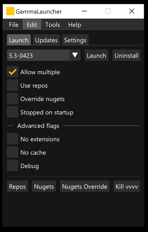
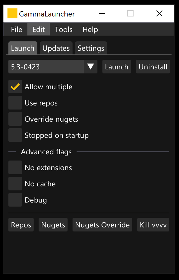
Who can spot the difference in these two screenshots of the GammaLauncher?
For me the latter one is much better on the eye because of a very tiny detail - I have moved the text 1px up in the buttons and interactive areas, so that the cap height and baseline have the same distance to the border of the buttons. Would it be possible to make this the default for ImGui buttons?
@chk It seems to be more related to the developers of imgui.
Since imgui doesn’t position itself as a “rich and beautiful” GUI, but as the fastest and bloat-free one, I don’t think it’s a point of interest for the original developers.
Try to discuss it directly with the contributors:
If I’m wrong, and this alignment is a problem that only appears at VVVV, then let me know.