pro-voting for superkalle
Couple ones for the road:
-
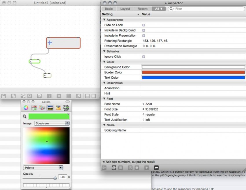
About background color, I was not a huge fan before, but I think it can really bring a huge addition. If someones wants minimal color default he can, if you want a color splash so be it, and if you want to really structure and annotate nodes properly by color you also can (and it REALLY increases patch visibility if you’re consistent).
-
About background color (again): Being able to set that by code (trough plugin) would be even more helpful, could visualize dx11 graph for debug, and would be able to display useful information.
-
About background color (never 2 without 3 is a french saying): It should take no more than 20 minutes to implement (please make it 40 minutes and add pins/links on the way ;)
-
Of course change text color since black on black is not very readable, ok now it’s gonna be a one hour (grand maximum) change ;)
-
Right click to change bang/toggle/slider value should be interchangeable to left (and use other button to move): as long as it’s not too bad with mouse (except that for every software it’s left button, so any new user will get confused), not a single chance to patch a simple ui for touchscreen.
-
Ability to change shortcuts : So everyone can balance mouse/keyboard the way they feel. Also since for this you’d need to provide a mapping action/shortcut we’d see some which we don’t know about (or less documented)
-
Dock for nodes : nothing to say ))
-
Dock for pins : as mentioned above, so we don’t spend time trying to click a 2 pixels pin, which will become 0.1 pixel with new zoomable version.
-
Tab/Window : Tab for nodes in same position, mentioned several times, most annoying thing ever.
-
Smart link : Link node to node and find the first available connection.
-
Code editor : Put option to remove “intellisense” (really doesn’t work for shader editor, wasting more time with it than without it). Optionally only activate on ctrl+space.
-
Shortcut to create subpatch and save file dialog to save in right place directly (like clone node, we can choose where the plugin/shader/module will sit, so same option for new patch would be really handy).
-
Show all pin names when you hover a node (eventually while pressing a key)
-
Show pin names when you look for available connections.
-
UI for global settings: having singleton nodes reduce readability, some global form options would gladly do the job instead.
-
Code editor to send message if file modified (mentionned already), since more or less every editor does that.
Many more other ideas, but getting tired and need sleep ;)
+1000 with vux.
As an example, this is what they have in max/msp. I think when creating complexe graph structure, this can be really help full to understand the whole strategy (when you unzoom ;) for example)
Lets not forget gray is the trademark for vvvv…
but minimal optional colour would be useful.
For me the Kalle Node is extremly usefull for two reasons:
-I find my patches faster in a bigger project with a lot of patch windows fighting for the top position
-It helps me not to get tired from grey
I would also enjoy a sensefull use of coloured nodes and connections.
Obviously it can be nice to have one node to change node color and text
But there is one imaginary feature that I am thinking about since a long time:
Visually separating Datatypes and Node Categories!
The feature could be activated with a hot-key when you need it.
Together with a zoom out it could help maintaining the overview of a patch and also can help structuring.
For example think about the connections as:
Blue - Values
Green - String
Red - Transform
Orange - EX9
Purple - Texture
So you switch to the green patch, you hit a hotkey, background gets the normal grey and the connections get colors and you find your texture processing part instantly because it is purple.
Actually in visualization theory color codes are very complex for the brain to get used to. Way more easyer to distinguish are different patterns.
So I would like to compare the above with:
– Values
… String
and so on. Like it works in max to separate audio stream from the other patch cords.
edit: and i aggree with vux’ note that a redesign of the mouse interface for touch screens is a very important thing.
i also love the simplicity of vvvv! (with UberKalle for a bit of colour (thanks woei))
(this is a topic for another thread, but…) i have been thinking of different shaped nodes eg. round, i will do a little video mockup soon to show what i mean.
actually i was thinking about the same. it makes sense from the perspective of touch interaction with vvvv. looking forward to your mockup
one minor thing i missed many times:
when creating a IOBox value at the end of a chord by middle clicking, the handy context menu appears to choose the IOBox style (bang, toggle, integer, …).
when pulling the chord from a pin of a boolean node the middle click results in a toggle automatically. how about a context menu with toggle or bang? (at least for input pins)