It’s clean and nice, patching feels speedy and the setup now is straightforward, I can see this as a really decent prototyping tool. (I’m not seeing this for actual software development yet in vvvv gamma even less so compared to vvvv and here’s why):
disclaimer: if I’m hearing as an excuse for any of my points that “there’s a keyboard shortcut for that”, no, that’s not valid, this is not Vim, it’s a VISUAL programming language. I presume people don’t want to memorize keyboard shortcuts for what’s supposed to be programming for the non programmer (I can actually apply that to vvvv as well but that’s a different topic). They want visual feedback and instant gratification from a visual language (which btw V4G provides well actually inside the patch, most of the time)
(also I realized I could have write these down to VL as well earlier but I mostly told the devvvvs about these in person as well, so sorry about that)
Start with the smallest: I love the new dark look, but black text on dark background is not great.
@joreg , what is your problem with proper windows title bars? with proper minimize, maximize, close buttons and an immediate visual indicator where to drag the window? If you don’t like them at least make your fake ones like in VS code or VS 2019. It is a “taken granted” common practice thing which burnt into our minds, it’s really annoying to drag around the V4G window at this point. At least make the empty area of the ““tab bar”” dragging the window (I always tried to drag it there out of assumption and muscle memory). The invisible drag handle is too thin and it has a minor problem that it’s invisible. The hand cursor doesn’t really help actually, it just makes it pixel-hunt less frustrating I guess.
VL / V4G works with more primitives than vvvv. The “everything is a node” in vvvv’s flat graph kinda worked and therefore the super minimalistic interface was justified to a degree there, however in VL/V4G there are way much more going on and now it feels like the interface hides really important things and structures without good reason. This will be a common theme for the rest of what I have to say here.
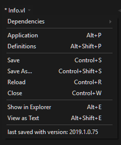
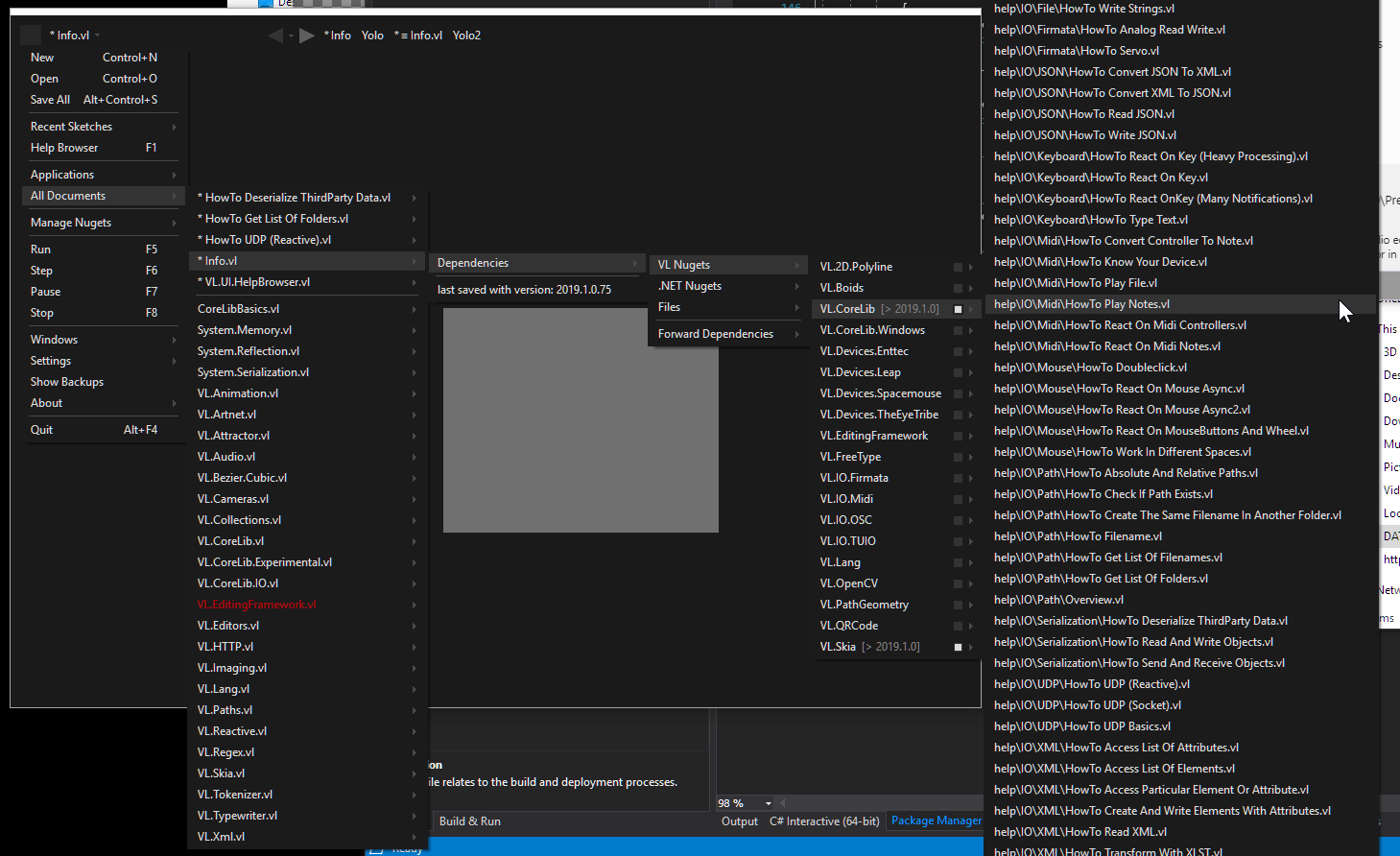
There’s no visual indicator how to create new patches inside a VL document. I’ve just pressed ctrl+shift+P because that’s what I’m used to from vvvv. It looks like I’ve created a patch but there’s absolutely no indicator now where that patch belongs, how is it represented in my project or on my file system etc. Now I discovered it’s in my definitions patch but that’s put in this menu: (from which couple of entries can actually become their full featured button)
and here comes my mantra: through the magic of multiple windows I would be able to see actually immediately that “oh the patch I created appeared in the definitions patch which seems to be the space where I can overview and organize my application components, and persistently see it while I’m working on those said components”.
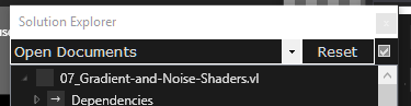
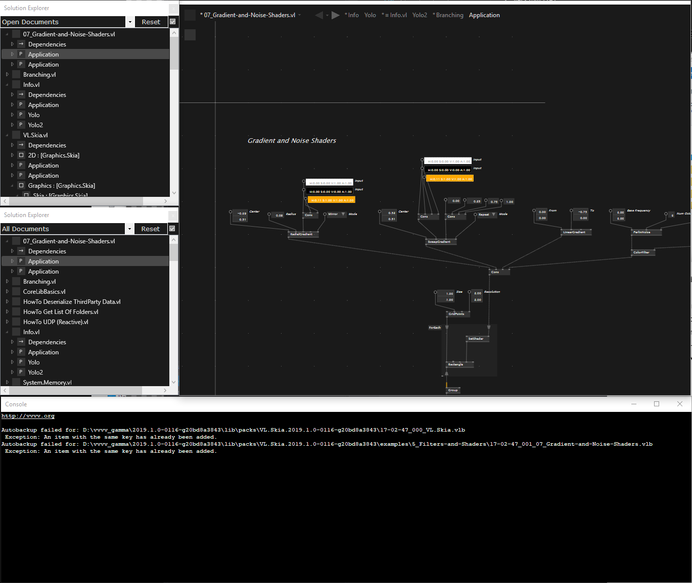
I also meanwhile discovered the solution explorer window and imo it gives now a better overview. It would be better to extend its functionality over mere visualization. Speaking of that
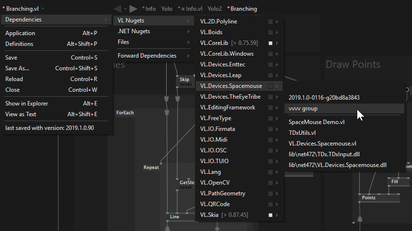
TBH I thought in the beginning that this idea was just an experimental dead-end doodle to see some alternatives for the dependency treeviews we all love and used to. There is so much wrong with this.
This is a perfect showcase demonstrating in what situations one shouldn’t use dropdown menus.
Dropdown menus especially coming from the ““files”” box should be only used for simple static list of commands. They should never represent mutable structures the user actively have to work with and understand.
I want my dependency tree view to sit in a persistent window and I don’t want to go through 5-6 submenus every time I need to interact with them or see what they’re depending on (not even mentioning the max 20*20 pixel sized button I have to hit first, again, every time).
while writing this I actually discovered there’s a solution explorer buried under the grey box menu → windows, yay for that. now here’s my suggestion: ditch the menus entirely and just use the solution explorer, and make that more useful with context menus and other widgets.
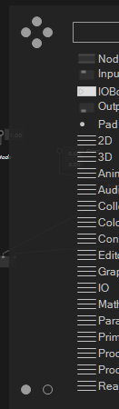
I’ve already said a feedback about those tiny dots in that empty space on the left side, but for sake of completeness I’ll say it again here, replace those with text or Icons which immediately communicate what it does. Tooltips doesn’t count, they’re not immediate :P As far as a total beginner would concern those might as well be just weird decorations.
there is no visual indicator what this 2 boxes do immediately. As I said some time earlier if you don’t want to write text use some icons. Everyone and their designer dogs make flat icon packs out there, use a free one or buy one.
Speaking of the main menu, again if V4G would follow some UI conventions that main menu could have been separated out into individual dropdown menus in a top menu bar (which btw can be the window title bar also á’la VS Code), sparing at least 100-300 ms every time you’d need something from it (for example the windows submenu).
what is the purpose of that checkbox next to the Reset button. Actually what does the Reset button there resets? Oh ok it resets the tree back to collapsed.
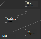
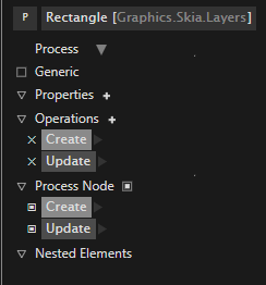
this goes in the good direction imo, but it’s really unpleasant to look at. I would either like to see it as a sidebar or as properties in the solution explorer. but that’s just personal taste. One which is bugging me a bit though is the Nested Elements. So far I’ve only seen them used in Definitions patches, is it used anywhere else?
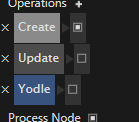
actually there are these toggle buttons on the right side when I clicked that arrowhead:
of course there are no visual indicators what they’re doing, and therefore I have no idea either. Are they enable/disable them or make them public etc.?
also there might be a bug regarding them because I turned them on and off couple of times and now I can’t turn them on again. Still without the knowledge of what I’m toggling.
Exception handling can be done more discreetly instead of the dialog box, in the console but with stack trace. Now that there’s a setting called RuntimePauseOnError which I hope means it breaks on exception, there’s no need for exception dialog boxes.
Some nitpicking: Start, Stop, Pause, Resume would also deserve their own buttons imo, especially when lower level graphics will be available and executing a patch before finishing a connection would end up in driver crashes; And it’s impossible to tell which tab is the one currently open, they don’t have different style when they’re opened.
so what I’m saying is, make it look and behave like visual studio because they nailed it :P (or make it happen inside visual studio ;) ) but joke aside, please consider to take some fundamental ideas from it. Look it’s already half way there:
I like how I can open as many Solution Explorers as I can fit on my screen, I wish I could do the same with patches. Speaking of which on a 4K screen of a work PC even a zoomed in patch feels really lonely.
Also take some inspiration from Blueprint in UE4 which has almost identical language features and objectives (even though with different visual paradigms), its usability is perfect, sure the GUI looks too embossed and bumpy by today’s standards (and big 3D button icons and patches looking like spaghetti made by a unicorn tripping on acid, urgh) but no one has to read the documentation to see what mysterious grey boxes are doing. Icons for example are precisely communicating their purpose (the smaller non 3D ones) and where are no icons there are straightforward text.
So hopefully you guys don’t take it on the wrong side, vvvv gamma has huge potential still it can be a great piece of software just don’t try to reinvent the wheel everywhere, especially wheels of conventions taken for granted and burnt into our thick skulls.
Agree with most things microdee says. I don’t see anything wrong with going for a more traditional Title Bar, Menu and Tabs, now that gamma is more of a single window afair. I can understand in vvvv with so many windows it would look kind of cumbersome to have a menu in every window.
I don’t think anybody would mind something like the following with a title bar, menu with dropdowns and clearly distinguishable tabs:
These are well known patterns that we have known in software for the last 30 years. Most people have large screens now so space saving is not an argument.
Also icons are something we are so used to and are great visual anchors to remember and recognize certain functions. I don’t see anything wrong with using them, although admittedly its much harder to make look decent than just using grey squares. I use these a lot and found them very versatile and minimalistic: https://www.streamlineicons.com at a good price and licensing terms.
With all the added complexity (and possibilities!) of gamma and VL, the UI should be the last thing that should add to the fairly steep learning curve.
Single window is major flaw in my mind, VL mostly reminds me of why I didn’t like quartz composer, with the added addition of less readable nodes, mutliple windows and the inspektor made it work in vvvv, the best GUI weirdness of vvvv is now gone leaving just the awkwardness. I do hope you manage at least split panes. The f1 is nice, but opening in 1 window again ruins its usefulness, you just end up with 10 tabs open and no idea what the refer to, what the heriarchy is, can’t look at one patch to see how to make it work in the patch your working on and end up having to switch tabs, which change in location depending on whether you’ve opened another one visually breaking your mind map. But I’ve mentioned all this before, just seems a shame to throw all the good bits out of a unique software instead of keeping them.
multiple windows will come of course, no worries. as said, we want windows and tabs to behave like you are used to from browsers.
but definitely no extra space for a header bar that always occupies pixels. most modern tools, like visual studio 2019 and chrome finally realized that this is not necessary at all. usability without bar is another thing, again visual studio 2019 is a benchmark here.
honestly i don’t understand, why you refer to the browser as benchmark that often.
tabs in a browser do not really have a relation between eachother, they are just a list of ‘apps’ you happen to have running at the same time. you’re view on one tab is not really missing out on anything else in another tab. just because you interact with one, another doesn’t change. i guess, you know what i mean.
vl is just not that quasi flat graph anymore, with records, operations, application there is much more nesting and dependency going on. like having a website spaning its content through a couple of tabs…
sure, the software should have an easy familiar entry. productivity / ability to effectively work should be equally important for a powerful piece of software to be recognised as serious player.
i know it’s not something you can just implement in an afternoon, however Sublime, vscode are good bar examples, on how the interface can look simple when you first open it, while still providing a lot of options to arrange the workspace to fit your needs. vs style would be perfect for me (were you can literally move every window to any position) but maybe a bit intimidating for the first impression.
content creation software now often solve that by providing different standard layouts (blender, c4d, adobe products…) maybe that’s a good compromise between minimal ui with no bars and tabs and a fully fledged multi window thing with menu bars etc. i mean, you have these basic to advanced/experimental switches already in the nodebrowser.
you could understand every patch as a web-page and every node(s) it defines as a hyper link back to it. so you can navigate the patch structure just like the web. and that’s what everyone is doing these days, i heard…
our current favorite idea is that every tab stores it’s history and for every node you see, you can decide whether you want to open it’s patch in a new tab or the current one, where current tab is the default. this should also keep the amount of open tabs down. currently the tab bar gets full quite fast…
to understand the overall dependency structure there might be other views, e.g. solution explorer.
and how often does interacting with one webpage change something in the other tabs?
i can totally understand that argument, to keep it uncluttered for traversing through the structure of the application, then it’s like jumping from one hyperlink to the next thing.
however while you are actually running the thing, i’m pretty often in need to be able to look at some patches side by side: if i change that value in a subpatch/record/operation, how does that affect some parent. is it affecting the thing i think it does or am i looking at the wrong instance… even more now that vl has observables, multiple mainloops, asynchronicity.
what i wanted to point out is, that at least i don’t interact with the browsers interface very much. i usually interact with the websites apart from typing an url or using the search bar. thus there would be more useful candidates to compare, which have been suggested by a couple of users.
and as also already said. no problem with the simple tab view for an easy entry for new users. i guess that’s also part of what made processing and arduino so successful. an super simple, not intimidating view on programming.
however most regular users used to substitute their simple ide with something else (afair eclipse for all the processing guys). which i guess will never be possible so our option is to nag you to somehow enable that for us.
unless someone or devvvvs do a Visual Studio extension, rendering the patches in document tabs, recognizing vl projects and leave managing project related files and other shenanigans to VS. @Elias already tried this afair from a personal conversation and he said it’s a pain to do though.
Just to re-iterate, when learning especially, you need to be able to read the manual AND look at what you are doing at the same time, in this case f1 opens a new window, you open help patches in there, and have their tabs there, rather than cluttering up your dev view.
Also in your browser analogy, you can tear off a tab so you can compare data from 2 pages at the same time, as I did only yesterday, on 2 separate monitors, while ordering parts off a parts list, on another web site, if I had to switch back and forth, I would have found that very annoying, and made mistakes.
The other option is running a help VL in a separate instance, and we are back to the crazy games we have to do in vvvv to make it work, and in that case I always use different colours for the patches so I can see which one I am working in, a css for each page haha.
I agree with microdee about most of the interface issues. It’s all full of little mysteries and riddles… (I’m also not the ‘dark theme’ kind of person, but that’s just personal taste…). I wanted to add one more thing that I think wasn’t mentioned: The icons next to the node names in the node browser… after working with VL for quite a while I still haven’t figured out what they stand for, or I keep forgetting. Would be nice if at least a tooltip would give me a hint…
About that browser analogy… I agree with woei that it’s not a very good comparison because you only ever interact with that menu once every two months when installing a new addon or something…
Plus, what ALWAYS frustrated me while browsing was that one tab would not tell me where it was coming from. I actually find these tabs are really bad interaction paradigm for navigating a web, but I guess it just stuck because no one had any better idea…
However, I keep enjoying working with VL (as soon as I have figured out how to get the light theme back) and I appreciate your work, guys. I know it’s not easy to ‘kill your darlings’, but sometimes it’s what you gotta to…
sorry for the ridiculously long wait for a proper answer. you’re mentioning a lot at once which doesn’t make it easy to reply. at some point then i thought it is best to wait for the now available preview, which adds the new tooltips, which hopefully mitigates some of the issues you found. so let’s see:
ad 1) was a styling glitch. we still have some but this one is gone
ad 2) titlebars take too much space. vs2019 is doing it quite good now. when we rework windowing (after 1.0) we’ll improve on what we have now
ad 4) after we found many people being confused by the distinction btw. application and definition, we spent quite some time figuring out how we can hide those for as long as possible in the learning curve. we’re now very happy with the situation, as in beginner workshops we don’t have to mention it at all. for you they are a no-brainer and you want to know where everything is from the start. and we can definitely improve for that. regarding the missing ctrl+p: we aimed at one clear path for beginners: the only thing you need to know for a start is to open a nodebrowser via dblclick. from there you should be able to create all elements. the mentioned case: dblclick -> write the name of the node/patch you wanna create -> choose “Node” and you get a node with your name. open the node, to see its patch. we even had an “Add Patch” in the menu at some point and removed it…let’s see. next all shortcuts will appear listed in the helpbrowser, but i can see us adding a few more necessary ones in the menu…
ad 5) it was an experiment in: what is the least number of clicks to reach things without having them on the screen permanently. i like it for some, but it has its flaws that’s why it will be reworked after 1.0.
ad 6) agreed on the dots. shall be replaced with text buttons.
ad 8) its tooltip says “Sync with current patch tab”, so basically you can say if it follows your navigation or not
ad 9) you can put a utility operation definition in any patch and it would show up there
ad 9.1) those now have tooltips
ad 9.2) should be fixed
ad 10) agreed. any such popup you see is not there on purpose
so i guess at this point we’ve understood that you’re not happy about some decisions we’ve made for 1.0, but surely you also see that 1.0 is just the first milestone and we have endless more ideas of how to improve after that. windowing and menus will be a big topic for sure. so thanks again for the extensive feedback. always welcome!
nice! I’m glad you got back to me, honestly I thought this has been swept under the rug, great surprise. Tooltips are really great judging from the article (I haven’t tried those yet myself) good job on those.
ad 2)
No windows device nowadays goes under 1600*900 and most are at 1920*1080 where title bars are already pretty insignificant sacrifices of working space.
ad 5) good. I hope “it will be reworked” means “it will be replaced entirely by the already existing solution explorer”.
clicks are not the only things you should count though. You should also count cursor travel and mental steps to achieve something. but regarding dependencies, nothing beats the good old lazy-loaded treeview or something similar. (which you already have in the solution explorer, you just have to pimp up that)
thanks again, keep up the good work! and please try not to reinvent the wheel when it’ll come to managing windows, docking and tabbing!
Just to echo my agreement about docking & tabbing. It’s hugely useful to be able to customise your workspace but then it to stay persistent - ie with docked windows. This was never possible with beta and always led to a decision between tabbing all the patch windows (and they would never stay tabbed) or having a chaos of patch windows all over, and never in the same place.