
Do you mean that the direction chosen by such a gesture can be changed back to the beginning of patching?
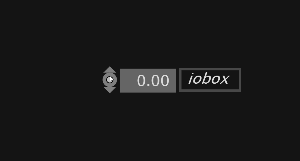
There is a new preview 109, where those border control points and pads and ioboxes got some more tweaking.
When you click on the connector you get the both-directions behavior which was introduced as it was too hard to understand where to click to get it right.
When you click above or below the connector you now get the feature back that you can decide early.
Dragging still is yet another way to decide early.
thank you, this is fixed in latest.
change log
- drawing attention of the user to the input and output indicators of the pins (same hover color as hover color in node browser) in the hope that people start drawing links less often on the node which leads to all the frustration. again giving view space more say in the decision how big the interaction area of a pin is
- fix for resize indicators & resize area. pins have higher priority
- all datahubs have an extra interaction area for connection gestures above and below.
- interaction detection: combining view and world space approaches. links and datahubs get picked by a refined cursor size (view space); independently datahubs now can have that extended world space interaction area. By that all zoom levels get the best of both spaces. the different cursor sizes get computed once and elements can work with what feels appropriate
- connected datahubs come with a less bold interaction area to make it easier to click the link
- selecting links via marquee doesn’t get disturbed by nearby pins (pick reason “select” filters out pin views)
- making sure that resize cursor and connection-direction indicators only appear when this is what would happen
- making sure sloppy clicks in general are clicks (until they are not and become detected as drags). we had a situation where depending on drag-area setting some clicks were not a click, nor a drag leading to the frustration of being too stupid to click
- patch explorer main button reacting on each click (not filtering out double clicks, allows for a quick peek)
- region view: improves interaction detection speed. all child views formerly got checked twice
- pick reason “hover” removed. Is conceptually the same as pick reason “any” by not giving much context info
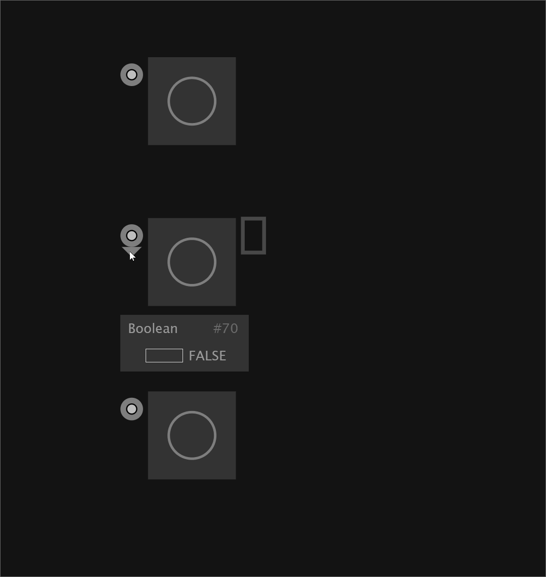
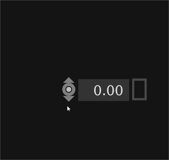
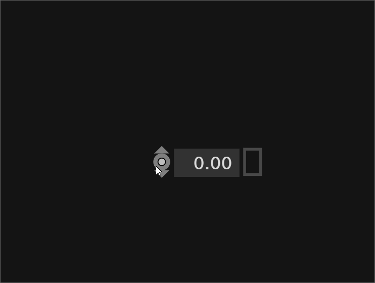
- control points and pads allow deciding upon direction on click (and indicate this)
- moment tinting in regions wasn’t quite right. fixes #6533
- fix: comment movable again
- styling the direction indicators
3 Likes
Right now its not possible anymore to change the direction after your first decision, so its basically the same as before. What I meant with my previous post is that it should be possible to change the direction from up to down or the other way after the initial click, when you are directly over the pad.
1 Like
Before the “both-directions-behavior feature”, you needed to find a small area inside the connector, which wasn’t visualized.
I would say it’s not the same thing, as you now as an instructor can explain your favorite way of interacting. There are different ways to phrase it now, but with those extra interaction areas, you can clearly map one behavior to one visual entity… and you have click and drag. So in my view all of this together should be sufficient.
I also though about that already. But Space key is already taken and I am already confused with all the modifier keys, so rather preferring the current solution, which already is way more flexible and much easier to interact with than how it was.
But ok: do you have a suggestion for the modifier key? And is this something you would want to explain in a beginner workshop?
1 Like
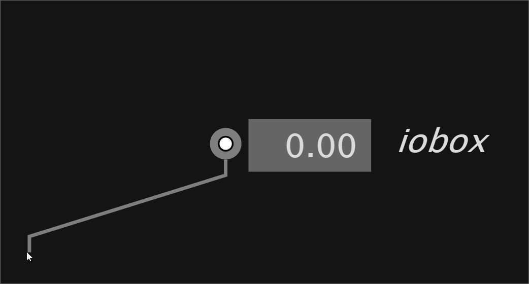
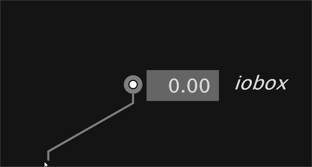
Hey, no I don’t mean by pressing another new key. The solution of this thread (Beginners struggle with starting a link from the bottom of an IOBox) was perfect.
I just suggest the area in which one can flexibly change the direction should not be possible anywhere in the patch, but only if the distance between the mouse and the pad from which the link is drawn is below a certain threshold. Like that, somebody could drag a cable out at the bottom and move it to the side without the direction of the link jumping to the top, which is the problem @yar is having.
EDIT: BELOW
This case should not “pass through”/switch:
But this case should:
1 Like
Oh, I see. Didn’t get the proposal…
Well, ok it’s yet another solution, but now that 2 or 3 solutions already exist I would like to propose giving those some more test driving before adding a 4th solution. If this keeps bugging people we can come back to this. It sounds easy enough to implement. The only critique would be: yet another area that either isn’t visualized or it is. Both have their irritation potential.
I guess the current solution is a bit straightforward.
Well, right now it would be visualized, as the arrows appear again once the mouse is hovering the pad, right?
The arrows ideally stay in the configuration when the link gesture started, indicating how the system interpreted you click or drag.
Ah: ok, you are saying that when hovering directly over that thing again is like saying: misclick, sorry, dear mouse handler, may I restart please. Yes maybe. But in certain scenarios it will undo your downwards commitment only because you now crossed that think again on the way up…
1 Like
I think it could be perfect, if the arrows just stay exactly how they are right now, and the link switched to the top in the very moment, the single arrow to the top appears.
Edit: could be perfect
Ok I understand it this way: there are three areas sitting over each other, which when you cross them will switch the link to upwards, both or downwards. It sounds not so awkward anymore.
1 Like
The thing is, it would be great to not explain this at all. Being able to flexibly change the direction of a link after the click on a pad solved a common problem many beginners had when learning vvvv. Sorry for being so annoying about it, but it really was a problem that was gone. And now it is back…
1 Like
nah, you are not annoying. I misunderstood your proposal, that’s all. It’s fine for me to search for the solution together.
2 Likes
you can test-drive a new preview where this is addressed.
1 Like
I think it is really good like that, thanks! Yet unsure, if the “switching area” of the pad should be a bit smaller. But it might be the solution to the problem @yar had with the BCP.
I think I was a bit too fast, it seems in my first test, I was lucky that it worked right away. See in the GIFs how many of my attempts to grab the link and switch it flexibly between top and bottom fail.
let’s use the 109 and the latest version for some time to understand which feels better over time. Would also like to hear from others.
When evaluating please put yourself in the shoes of trying to achieve different things and if the solution is balanced to achieve both with ease - after getting used to the gestures of course.
It’s not always about switching link direction flexibly. It’s sometimes about the opposite - can be annoying if it does as @yar was pointing out.
The gifs don’t help so much as I don’t see if you click or drag. It makes a difference, as the drag direction is taken into account. When clicking it’s not so obvious and in the 112 a click always is a both-directions link. A drag will be a one-way link if the drag was vertical. If you want to reconsider you always can come back into that area and fix your link. But yeah as I was saying earlier. The area isn’t visualized and therefore it has it’s blurriness to it.
109 is less magic in that sense.
1 Like
I just installed 112 and that is quite interesting.
I was plagued by “the wrong direction thing” during Genuary quite a bit, for instance with splicer outputs in cases where the issue didn’t make any sense like dragging a link from the splicer output but it insisting to be on the inside.
This solution for it being actively switchable while being close is good, although in 112 the area where I can switch feels rather large sometimes.
I would be fine to it being relatively small around or just over the connector, so it doesn’t feel random when one works in more crowded patches.
The “going over the pad to change direction” feels pretty intuitive, so I wouldn’t want the area too large.
I definitely wouldn’t want another shortcut… ;-)
109 feels more rigid there. Not bad, more “logical” in a way, but if the change-area is really small or just over the pad, so it needs a conscious decision to change direction, I’d be very happy with the change to it being switchable.
@chk sorry, I guess I missed to explain that in the 112 you once have to leave the area. The reasoning was that you’d typically still want to give your initial gesture some credibility and only come back if you have to.
1 Like