ok, i checked your proposal, click and typing. this does not make sense when you want the “code completion”, it overwrites the suggestions. dragging the cable out, release and looking a the node browser with suggestions is still quicker
and regarding the category icon. you don’t have to use a specific category icon like a folder or hamburger menu. you can keep the type icon and indicate the category with an arrow. and it visualizes very clearly that a category is not a node but leads further down the rabbit hole.
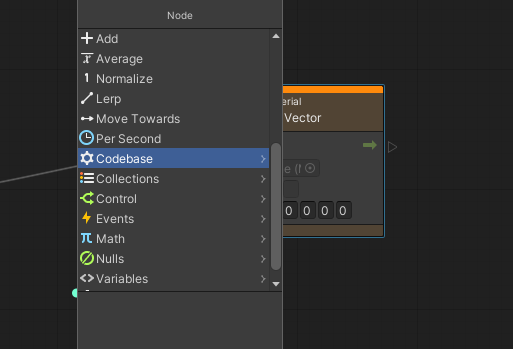
the current folder icon has its issues, with a circle it looks like a camera
ps: there was once a software who knew about category arrows ;)
2 Likes
If the Record visualization reminds you of a camera that can take snapshots: that’s ok - as this is the main idea of records: being able to produce immutable data snapshots. I like to see a vinyl record in that very minimalistic thing. Where the class icon reminds me of a living thing, like a snake or even a timeline. Or it could be a music tape, that you can overwrite - in contrast to what you can do to a record.
But for sure these can be debated. The folder icons were just meant to be a “bit better” solution than the three lines.
sure, i just post my thoughts here
Of course, and btw thank you for that! It actually helps…
1 Like
Following this thread:
It might be helpful to introduce an indicator on the aspects (maybe as a very verbose text entry „nodes found in advanced/experimental) or the less helpful way for beginners: highlight the aspect circle in question (which they will also miss then, but it’s a small improvement)
Resolume updated their node browser (demo starting @ ~1:30min):

I really like the create multiple nodes in a row feature (~2:50min).
5 Likes
Agreed, same as houdini - it’s really handy.
1 Like
they also seem to have this drag-out-cable behaviour. blender just did an update to their geometry nodes and also implemented drag-out-cable-release starts nodebrowser. seems to be a standard interaction now.
edit: i really like the category columns navigation in resolume. this gives a better indication where you are and enables you to switch categories much faster. the chosen categories in gamma are in a weird place… bottom right. this never made sense to me. ignoring existing (working) concepts of navigation and reading direction.
2 Likes
And that thing looks super snappy / responsive.
Haven’t made a direct comparison, but gamma node browser feels sluggish in comparison.
The resolume video has 60 FPS, thought about recording one for a similar interaction then counting frames for a more objective comparison.
proof of drag-out-cable in blender update

1 Like
this gesture seems to make sense for environments that use connecting links via drag, but this is not the case in vvvv. in vvvv you can just start typing while having a link at the mouse.
the drag a link gesture would be a bit alien in vvvv, and i always have the feeling that it is breaking my fingers when working in an environment that uses that gesture, especially when linking across a bigger patch.
but sure, many come from being used to dragging links, i wonder whether both could work at the same time, like depending on where exectly you release the mouse… but that could also be too many roads to rome.
1 Like
hehe, i’d argue that i’m very very used to vvvv’s interaction, using it since 2004, but recently discovered that the dragging out the node browser of a pin seems quite a natural way of doing things.
how would this work when you want to see node suggestions of a pin ?
yes, it would, right now, when you try to drag out a cable from a pin, you start a selection rectangle, which does not make sense
click hold and drag for node browser, click once for just holding the cable would seem intuitive?
6 Likes
yesterday i learned a faster way to setup pads in a record, just typing the name and then choose pad. maybe list pad first when being in a record ? that would speed up things. or is there a faster way then looking for pad down the list.
my biggest concern is finding nodes, often it feels like i have the wrong strategy, lets say i want to change the circle color and i don’t remember fill. the hint would be skiapaint. but when i type this into the nodebrowser i end up with the wrong stuff. this is just one example of many. what would be a better way to look for ?
1 Like
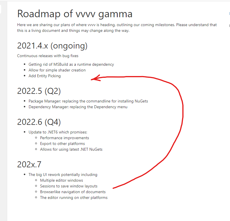
this depends on a new UI framework and moving everything to .NET6, which is a big undertaking. this is the reason why it is moved to later this year. we still need to evaluate whether the new .net MAUI (which isn’t released yet) or Avalonia is the way to got. Or even a combination of both…
we did some research with Avalonia, and we liked it because it has strong Linux support and can even run in “frame buffer” mode, without any Linux desktop system installed. that would make it perfect for kiosk apps on small machines with a basic Linux kernel, even Raspberry Pis… so you can produce hundreds of embedded systems at a low cost. that’s how the devvvvs dream…
8 Likes
not the patches, that is custom code developed by us, it is about the framework of “the things around it”, the connection with the operating system. it is windows forms at the moment, which isn’t cross-platform.
Unfortunately they don’t seem to have a wayland backend (yet) and X11 is on its way out. Afaik most major distributions are now using wayland by default.
That would also entail moving to Vulkan I suppose?
With a desktop system DX11 could work with wine. My latest tries getting a compiled exe to run using bottles / Wine 7.1-1 under Manjaro have failed though.