Hi.
I’ve got a pretty weak case of colorblindness, but even though it’s very minor it already gives me trouble sometimes recognizing the different colors of operations in gamma.
I would suggest to take a look at this and change the color palette accordingly:
Or have a “colorblind” mode. I think this makes a lot of sense, since a pretty large amount of people ( 1 in 20 it says in the article) has a condition like that.
The css is in the UI package, you can just copy it and change the colors for the operations and then select it in the settings menu.
I’m actually wondering why aren’t many people doing that already…
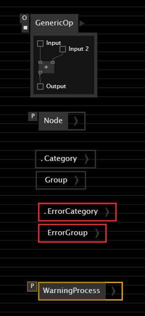
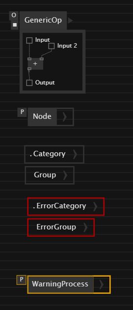
But adding a theme for the different types of color blindness sounds like a very good idea. I have problems with shades of red and spotting an erroneous pin is almost impossible for me.
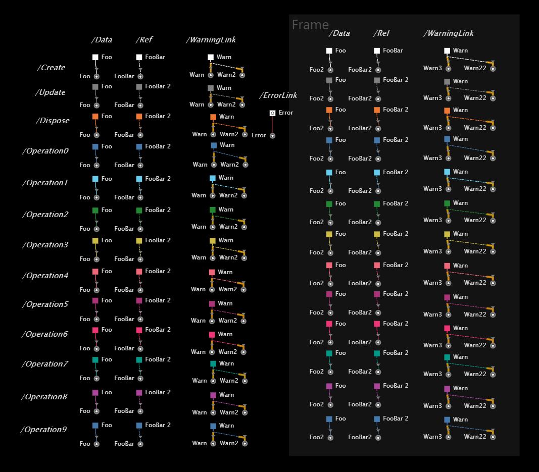
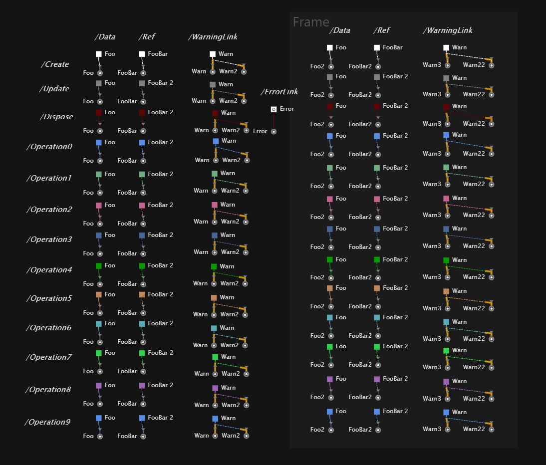
I took the colors for operations from Paul Tol study on colorblind safe palettes Paul Tol's Notes
It was hard to find unique enough colors for 10 operations. As with the original Dark theme they are a bit close for my liking. I would be interested to know what people with colour blindness think.
Because it’s always going to be difficult to find 10 unique colours (plus dispose) I still think it would be great if the user could define in the patch which operation takes which color (from the palette) and when you have a set of operations that weave together then you have the power to choose two appropriately different colors from the set.
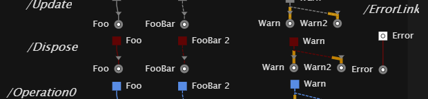
For this theme I chose to make dispose operations orange rather than a shade of red. You can see in the original theme it’s very difficult to tell them apart from a link with an error and I think it makes sense red is reserved only for errors. I would say most users make use of dispose relatively rarely, so long as its some unique color it’s still functional.
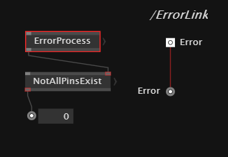
It’s very difficult to achieve high contrast with Error links. They take the same error color as the frame highlight on the process next to them and you can see how much more difficult they are to read. (And error links are something I am often hunting for visually). It would be great if we could differentiate these further by increasing thickness or add a further stroke effect to these (like a white and red dash or similar)
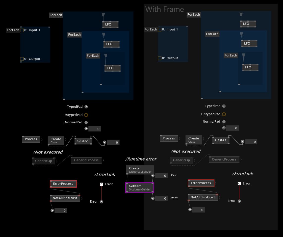
I chose to color regions to differentiate them from (grey) frames.
So far I did not recolor all the frames… don’t have time to check if every possible frame color fits with every possible link color.
So far did not recolor solution explorer or help browser.
Cannot attach CSS files to forum posts so this is zipped
Note I ran into a bug where I could not return to the default theme. If that happens open your vvvv installation folder under program files, go to the stylesheets folder and copy the original dark and light theme into the custom themes folder above.
If anyone else would like to make improvements absolutely feel free to build on this
If you would like to develop your own theme here is the patch I made to test the themes out. I’m sure it’s not complete but it’s a start. ThemeTest.vl (102.4 KB)
I am trying the new high contrast color scheme and really love it. But I noticed that the menu on the top right now behaves weirdly and I cant actually get to the themes tab any more!?